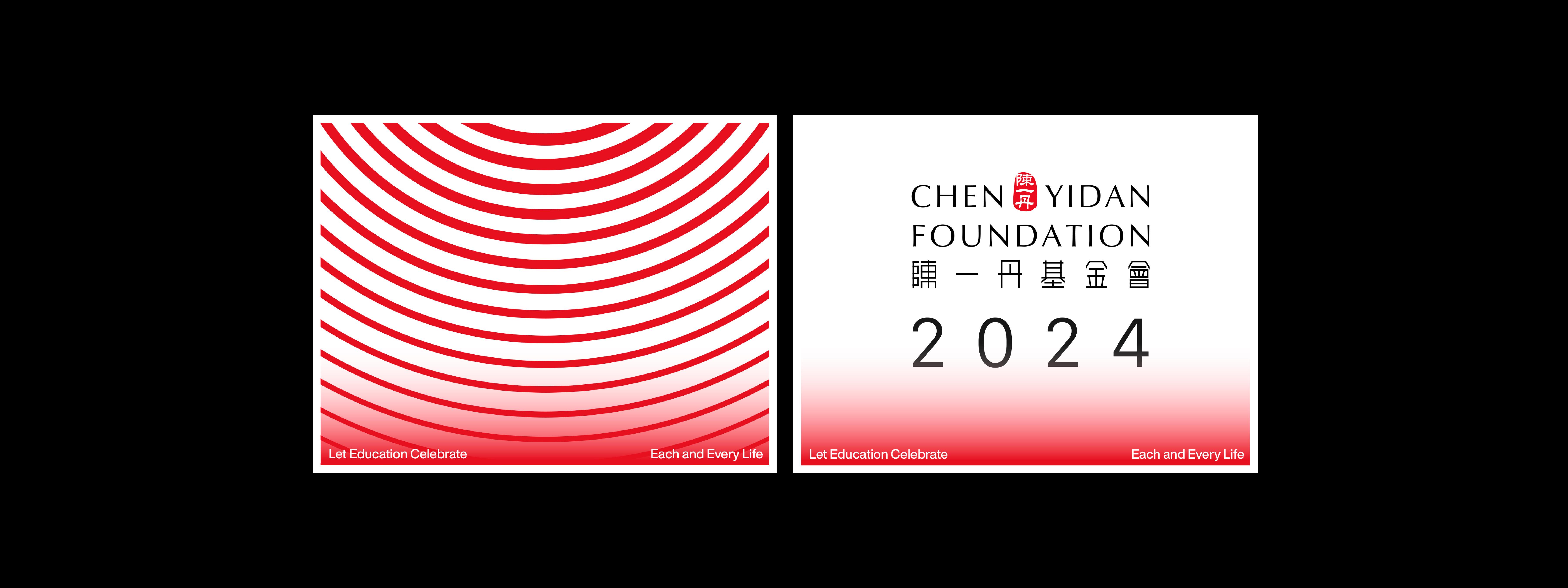
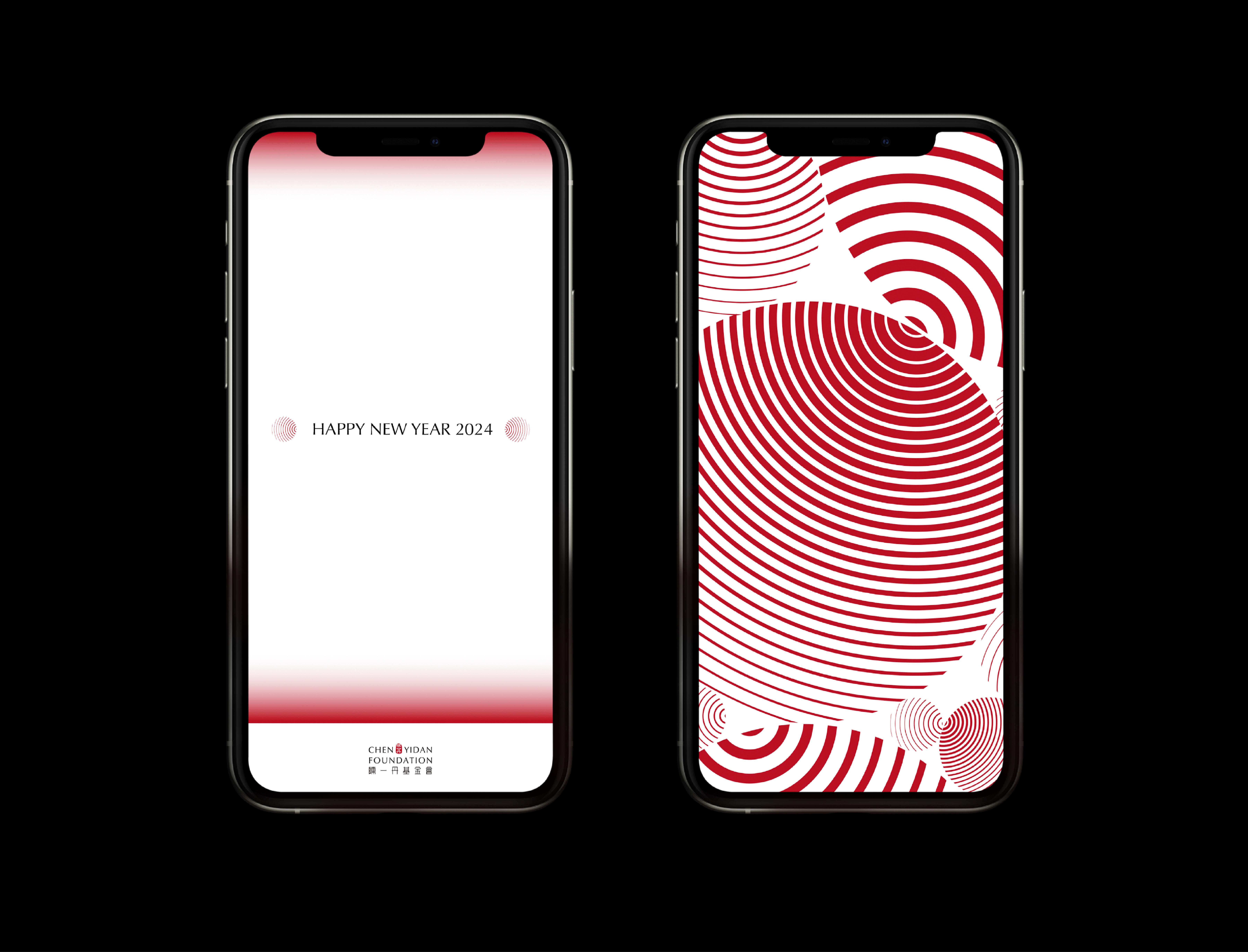
背景: 2024年,新年来年之际,陈一丹基金会希望抛弃以往的形式,而用更加令人深刻的形式来振奋人心。 创意: 陈一丹基金会的VI中主要元素是指纹,色彩为红色。设计上要基于目前已有的这两个主要符号进行延展, 打破以往刻板、中正,相对冰冷的对话方式。巧妙的利用“一封互动信”,拉开陈一丹基金会各个平台、 学、者、工作人员的2024新篇章。 基于“一封互动信”的概念并结合VI系统的颜色与元素,将指纹与烟花、人本、教育、多样等关键词融合, 进行整体的动效设计,从而打破固有印象。通过视觉与动效的简单演绎,即保持了以往基金会的基调,用 让“一封互动信”变成了“令人深刻的一封互动信”。
BACKGOUND: In 2024, on the occasion of the coming New Year, the Chen Yidan Foundation hopes to aband- on previous formats and instead uplift spirits with a more profound approach. IDEA: The primary elements of the Chen Yidan Foundation's visual identity (VI) are fingerprints, with the color being red. The design should be an extension of these two main symbols, breaking away from the past rigid, conventional, and relatively cold dialogue. Cleverly utiliz- ing an "interactive letter," it opens up a new chapter for the Chen Yidan Foundation across various platforms, scholars, and staff in 2024. Based on the concept of the "interactive letter" and combining the colors and elements of the VI system, fingerprints are merged with keywords such as fireworks, humanity, educa- tion, diversity, etc., for overall motion graphics design. This breaks away from conventional impressions. Through simple visual and motion graphics interpretation, the foundation maintains its tone while transforming the "interactive letter" into a "profoundly impactful interactive letter."


