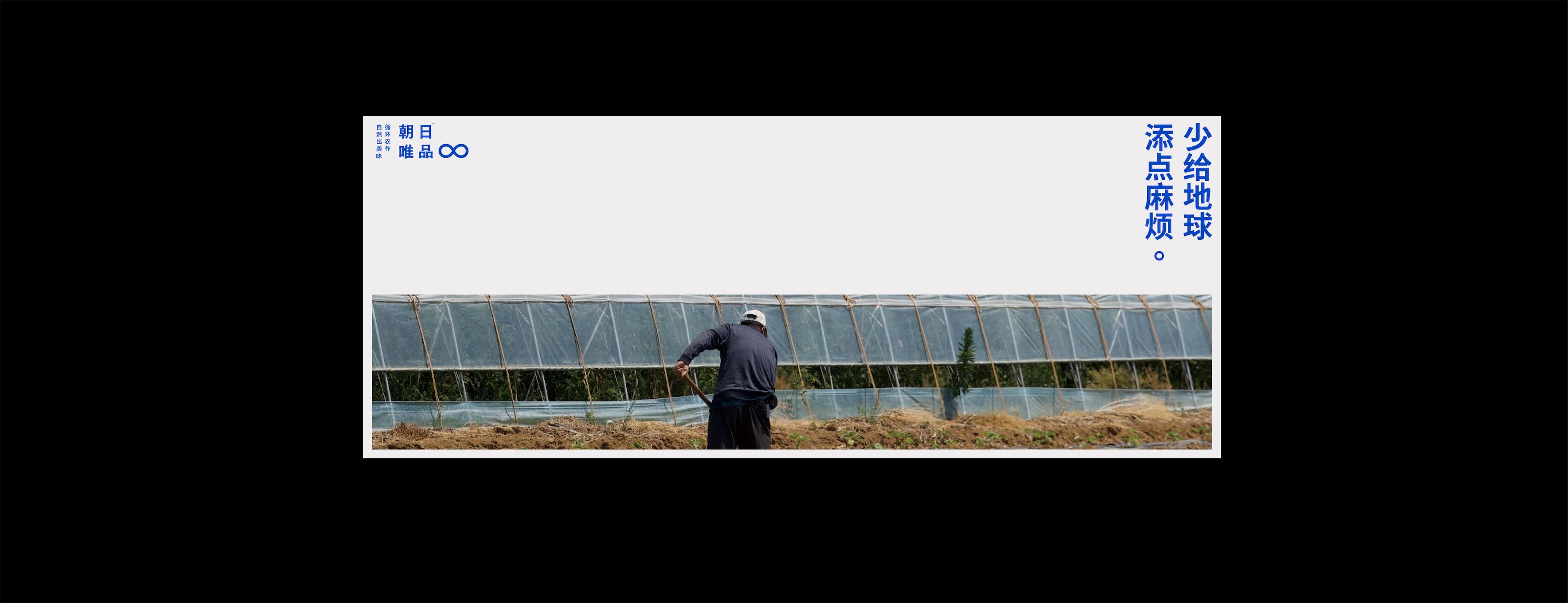
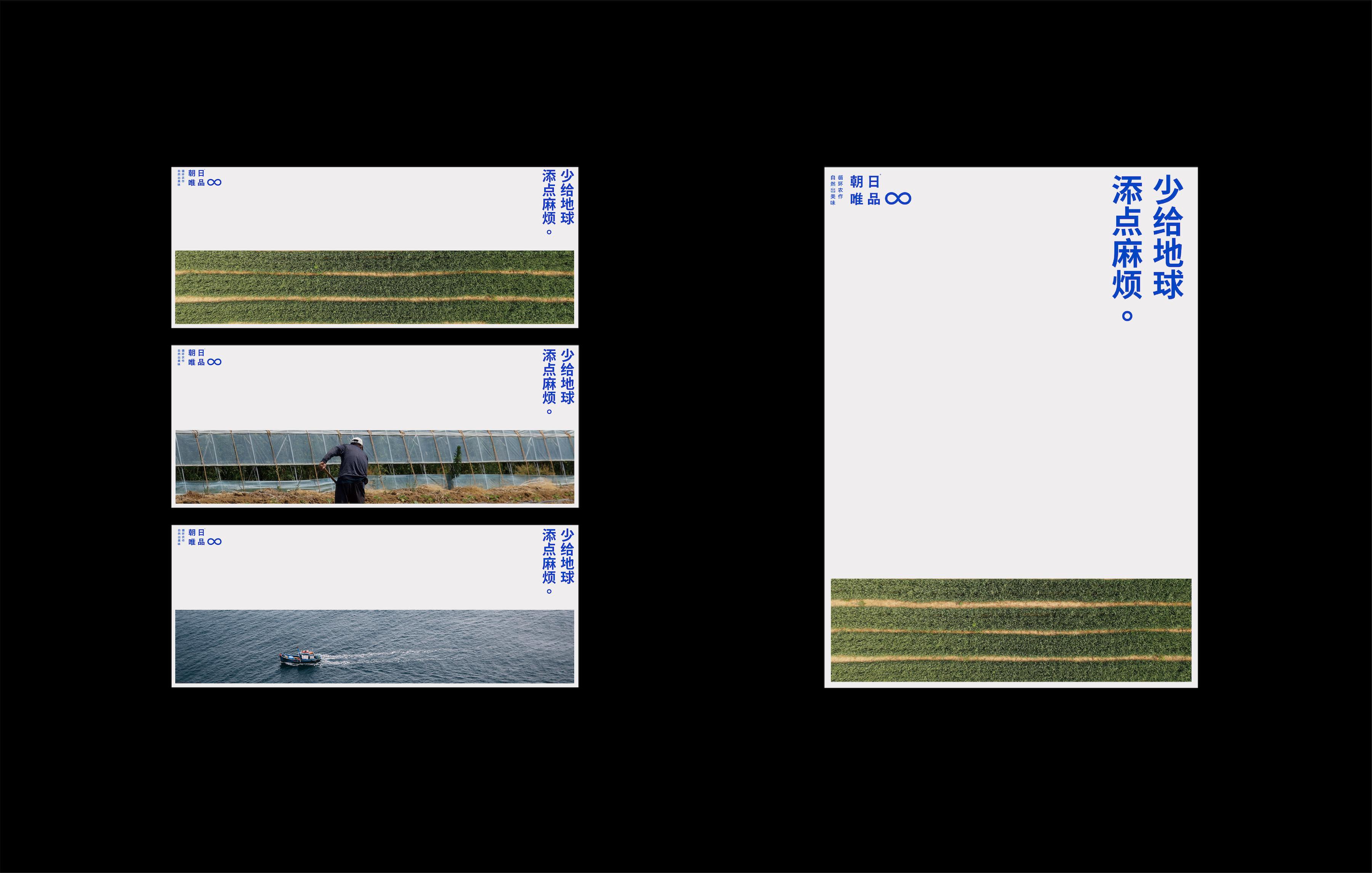
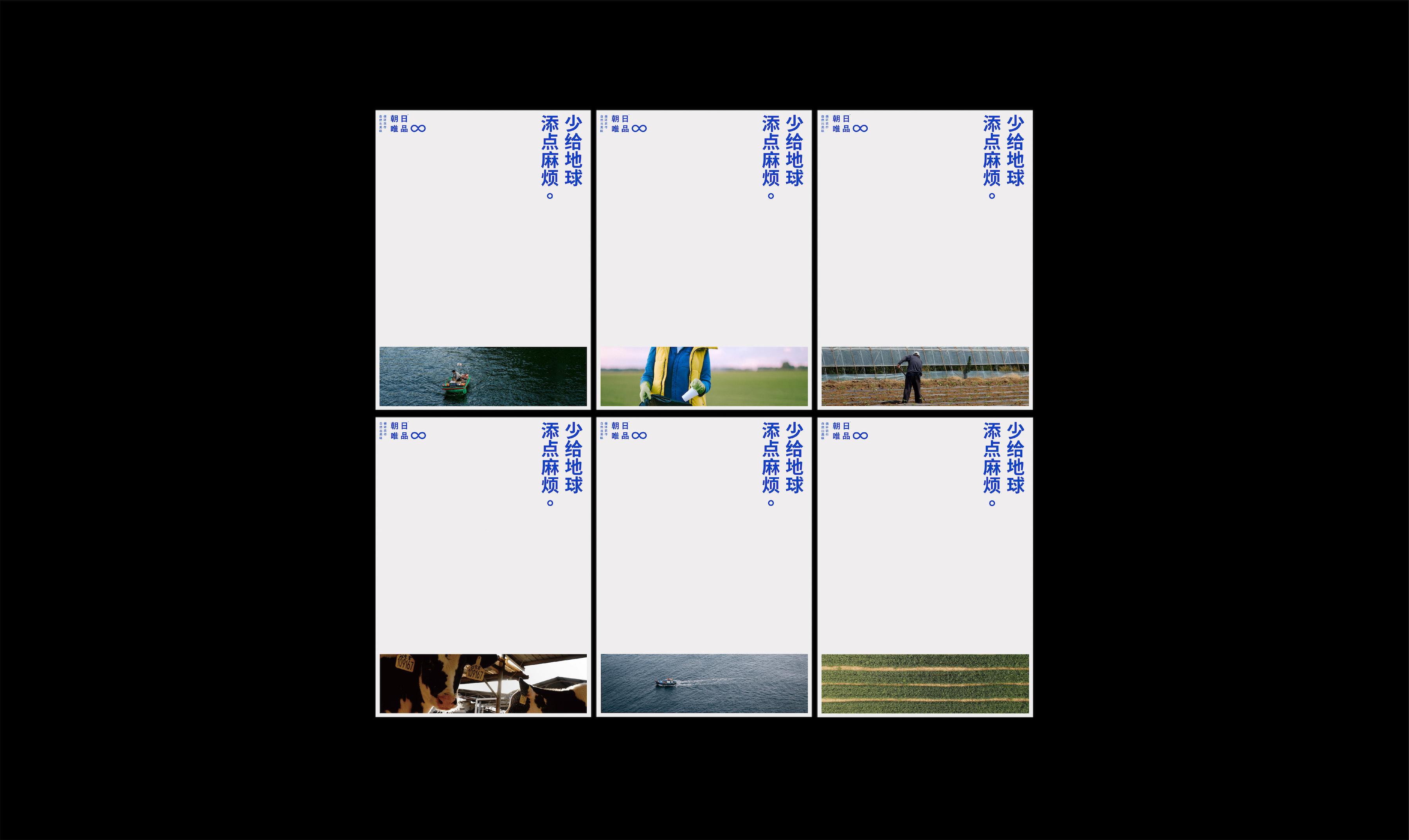
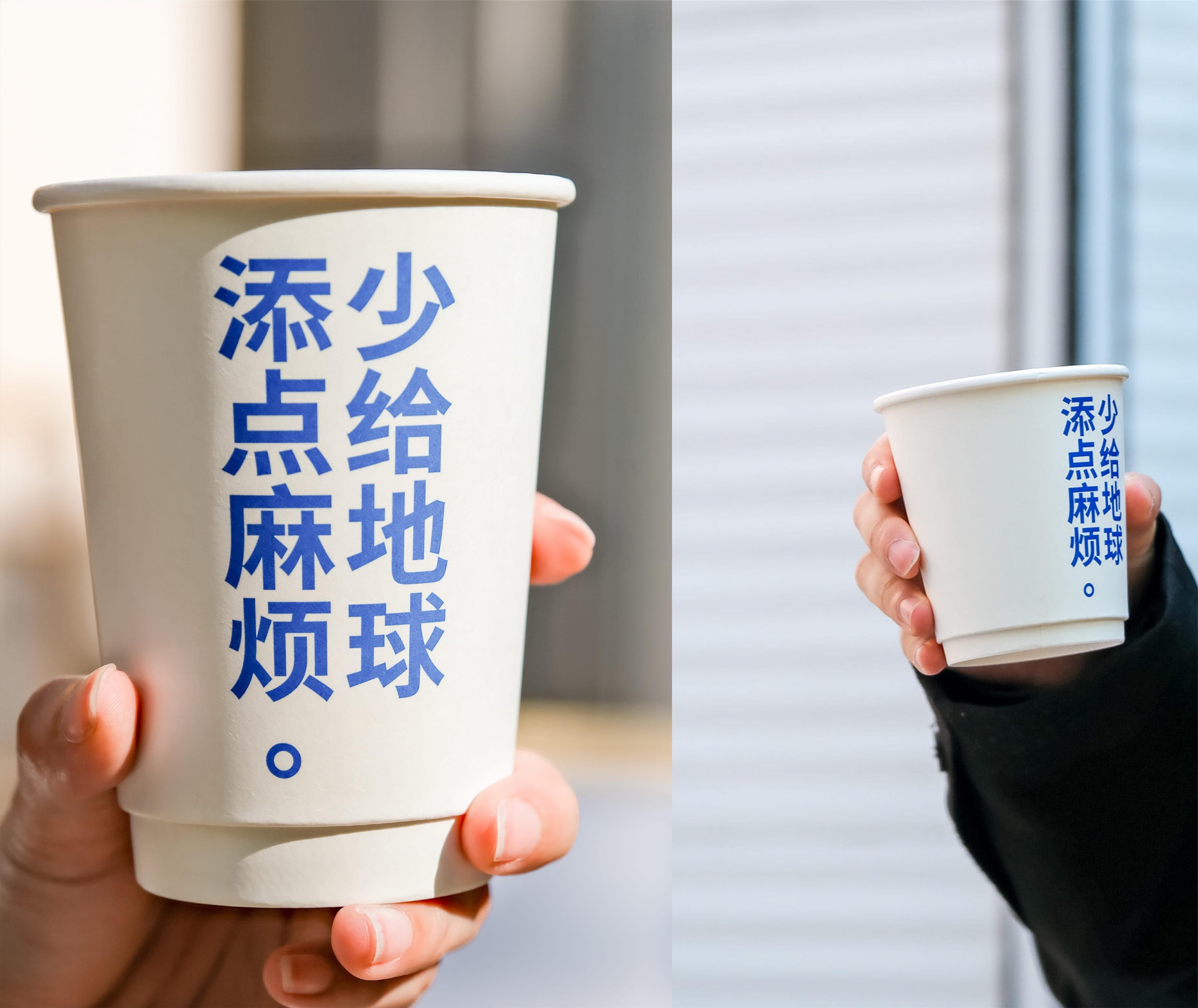
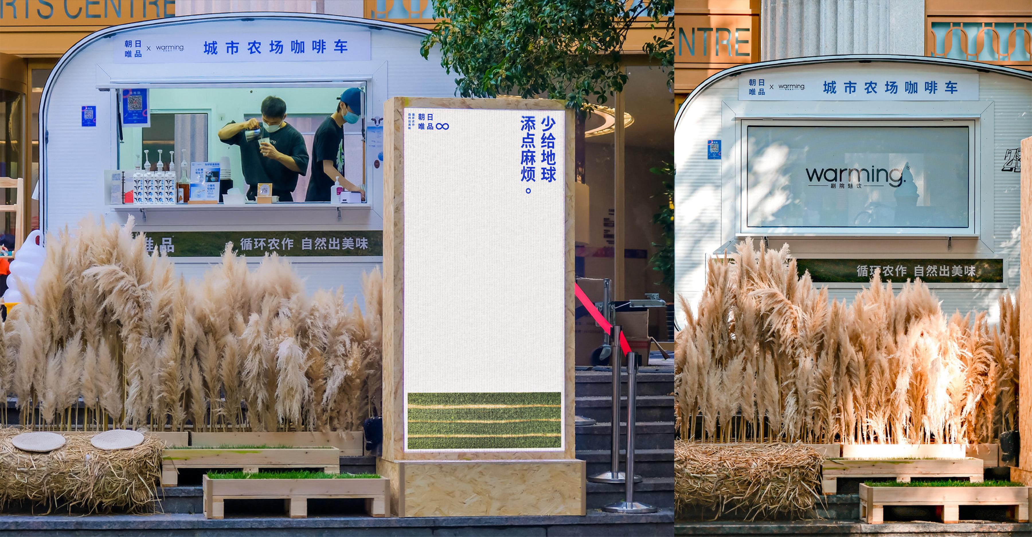
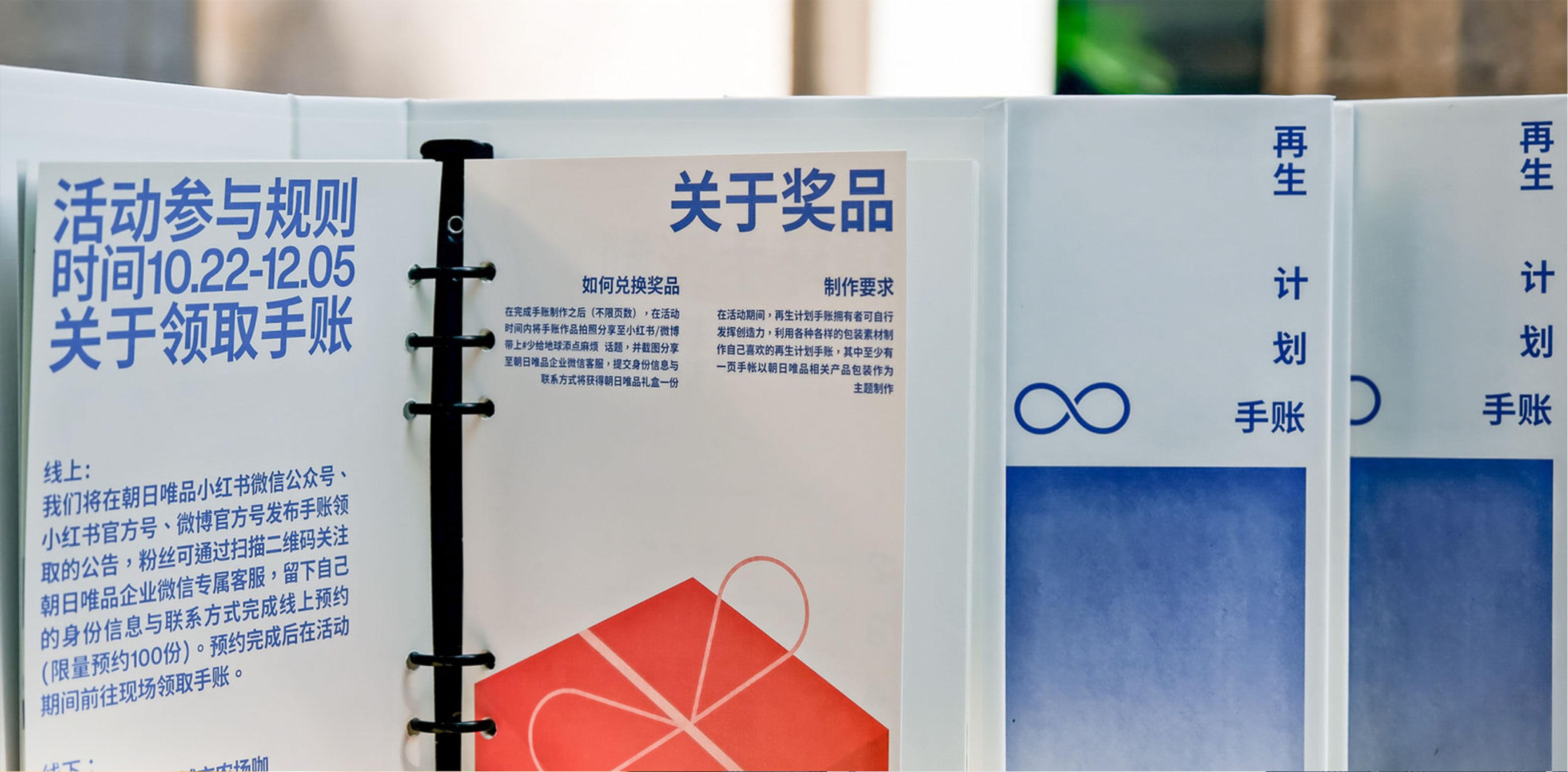
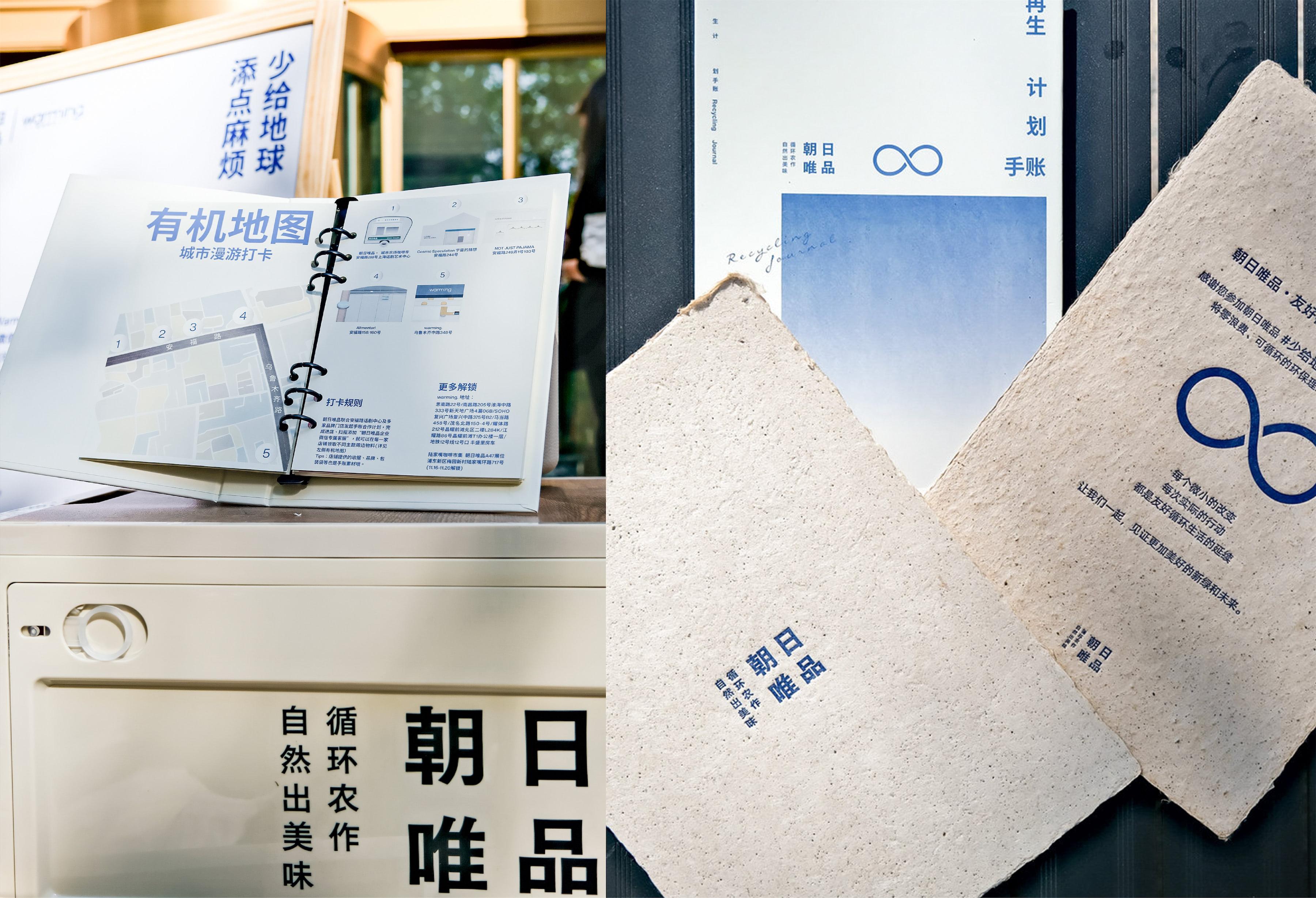
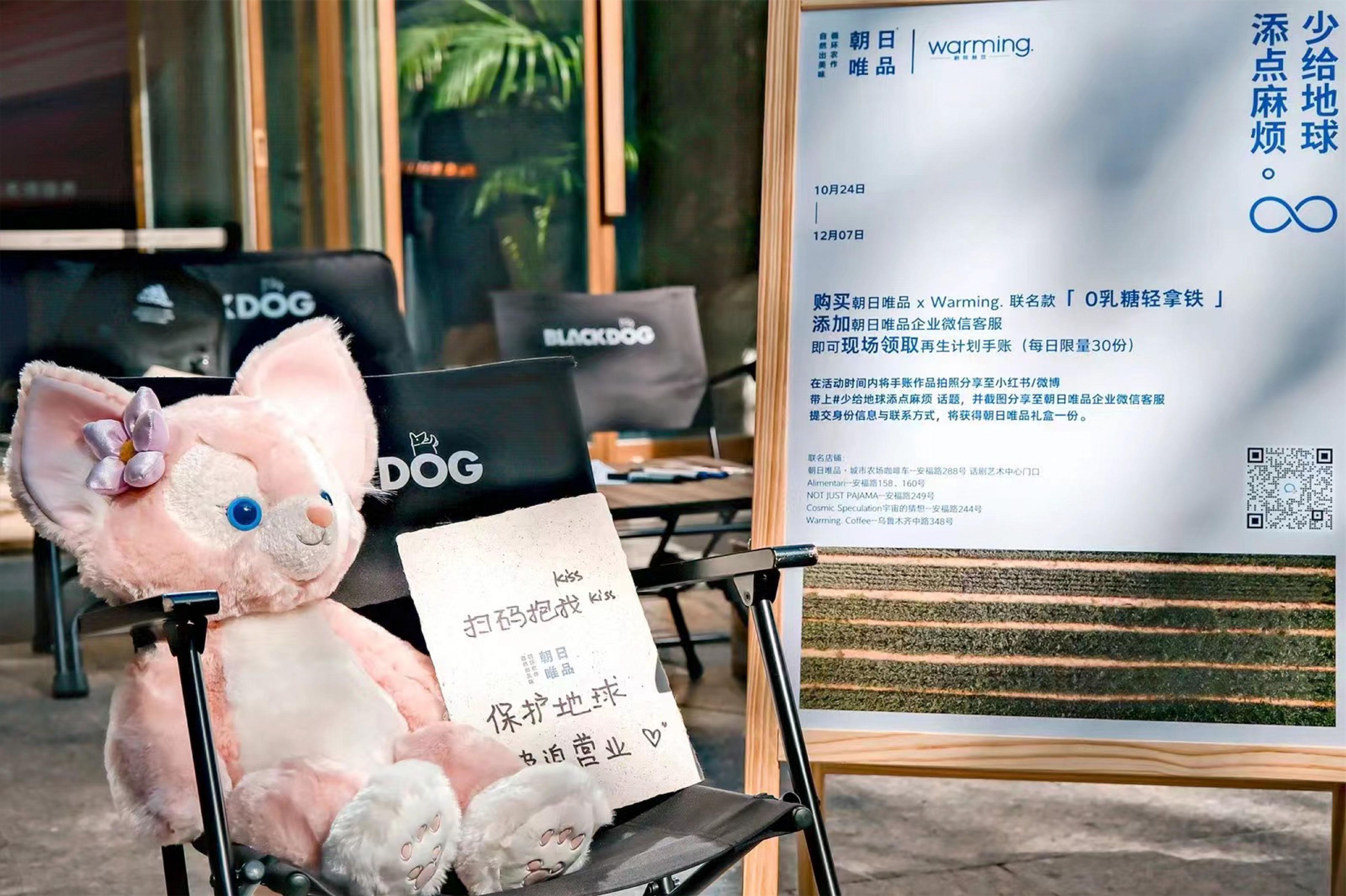
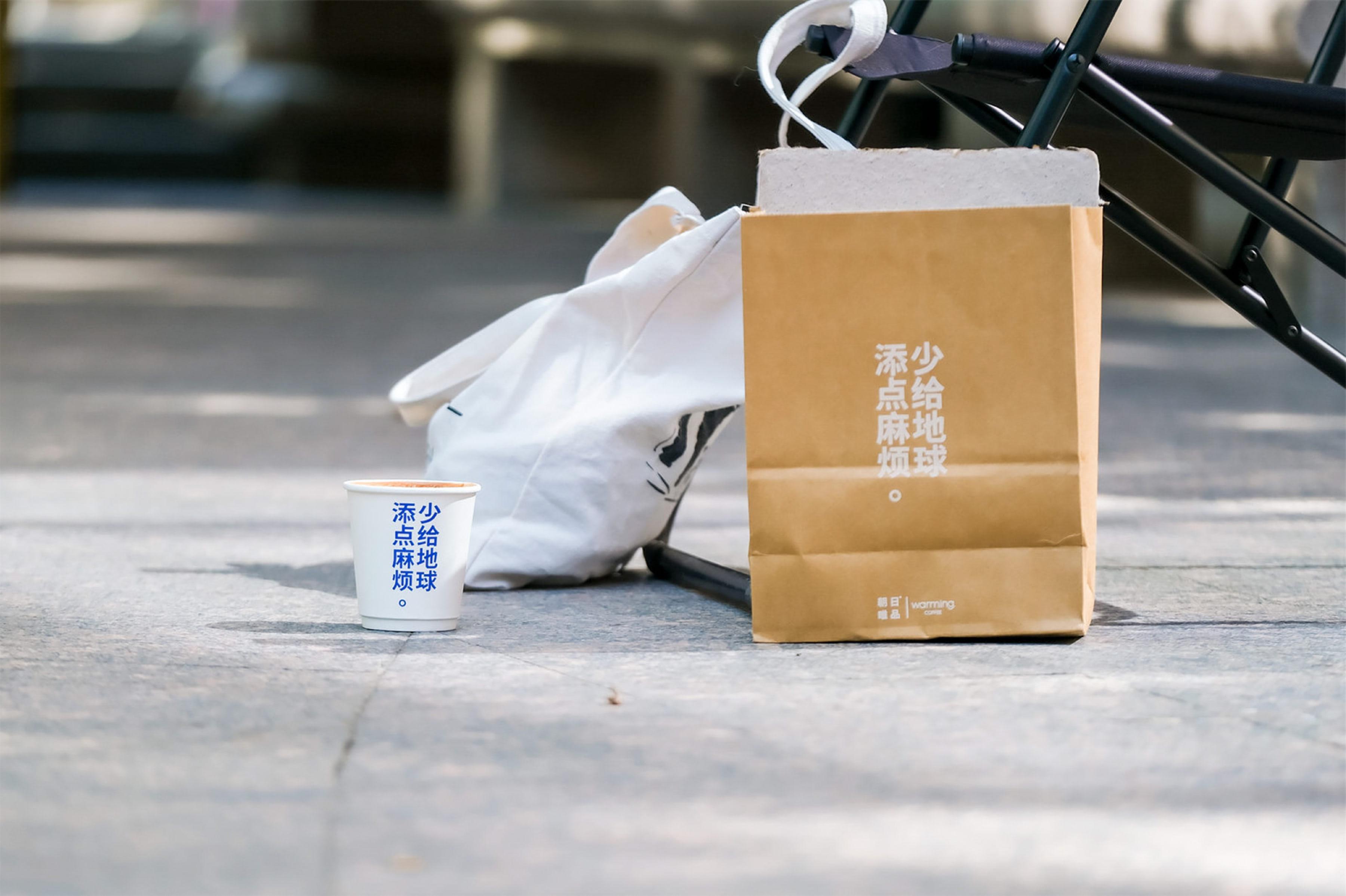
背景: 朝日唯品是一家新兴的牛乳制品品牌, 他们在上海安福路举办了线下活动“少给地球添点麻烦”,主要聚焦在安福路的咖啡店中, 以“咖啡绝佳伴侣”的角色,让各类KOL与路人进行线下打卡活动,线上传播。 本次Rifling承担主视觉设计与打卡的核心道具——“再生计划手账”设计。 创意: 将主题“少给地球添点麻烦”进行概念提纯,准确来说这是一个“Call to action”的活动(行动起来,具有 动员性),这样理解最重要的必然是“少添”。(To do)设计应将最重要的内容放大,这是活动呼吁中最重 要的信息。我们将“少添麻烦”凝练为符号“-”(减号)。减号作为符号没有认知成本,又能很好的表达“少 添”,我们将图片设计成了1:6的横向矩形就像减号一样,来对应“少添”。 朝日唯品具有很强的产品基调,类“MUJI”是品牌最大的标签,“简单”、“清爽”、“明确”这些便是核心关 键词,那么在整体的设计风格与插画风格也许完全保持一致。 结果: 客户认可“-”与“少添”之间的关系,在手账中的插图也很好表达了“朝日唯品”的调性,在小红书、微博、 抖音、微信视频号等多个公众平台,获得近120W的浏览、15W的转发。并被多家媒体报道。
BACKGROUND: Asahi VIP Goods is an emerging dairy product brand. They organized an offline event called “Don’t Trouble the Earth” on Anfu Road in Shanghai, mainly focusing on coffee shops. They played the role of “excellent companion for coffee” and engaged various KOLs and passers- by in offline check-in activities, which were then spread online. The most important aspect of the campaign was the design of the main visual and the core prop for check-ins, the “Regeneration Plan Handbook.” IDEA: 1、The theme “Don’t Trouble the Earth” was visually condensed to convey a sense of action (“Call to action”). From the theme’s perspective, the most important aspect is the action of “Don’t Trouble” (To do). Thus, the visual design should highlight the most important message in the whole sentence. We condensed “Don’t Trouble the Earth” into the symbol “-”, which signifies subtraction. The minus sign requires no cognitive cost and effectively expresses the motivation to “trouble the earth less”. Therefore, we designed the image with a 1:6 aspect ratio to correspond to the “-” symbol. 2、Asahi Only Goods has a strong product orientation, similar to the brand “MUJI,” with “simplicity,” “refreshment,” and “clarity” as core keywords. Therefore, the overall design style and illustration style should remain consistent. RESULT: The client appreciated the symbol relationship between “-” and “Don’t Trouble” and the visual expression of “Asahi Only Goods” in the handbook
