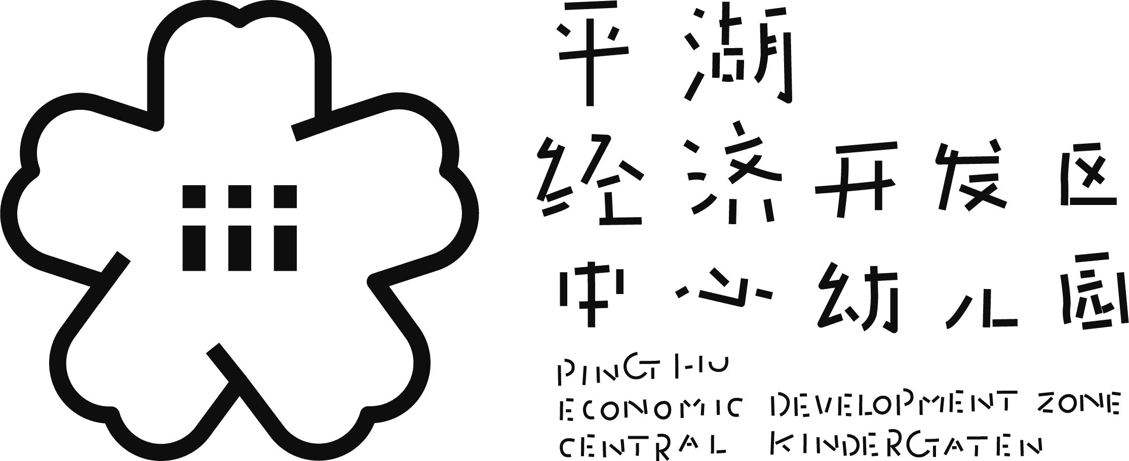
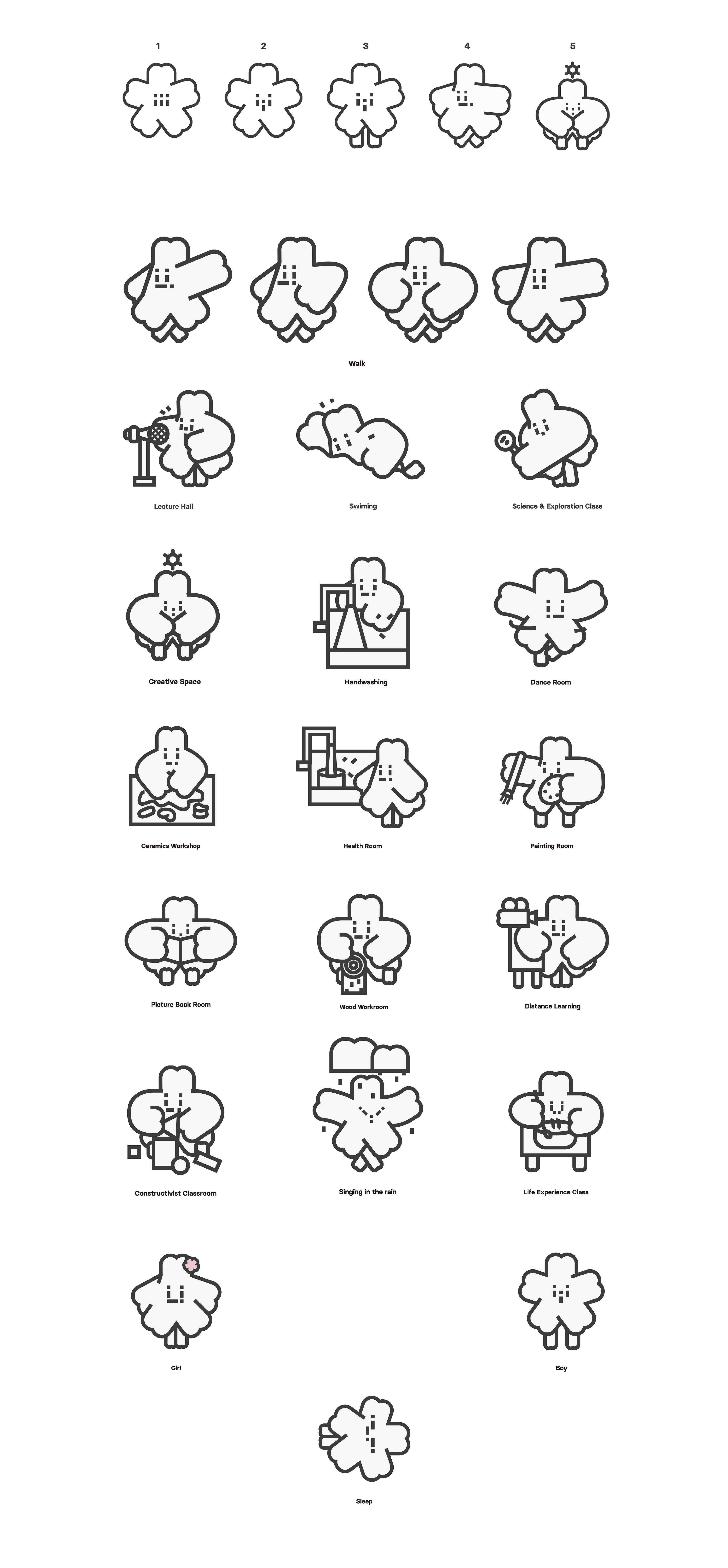
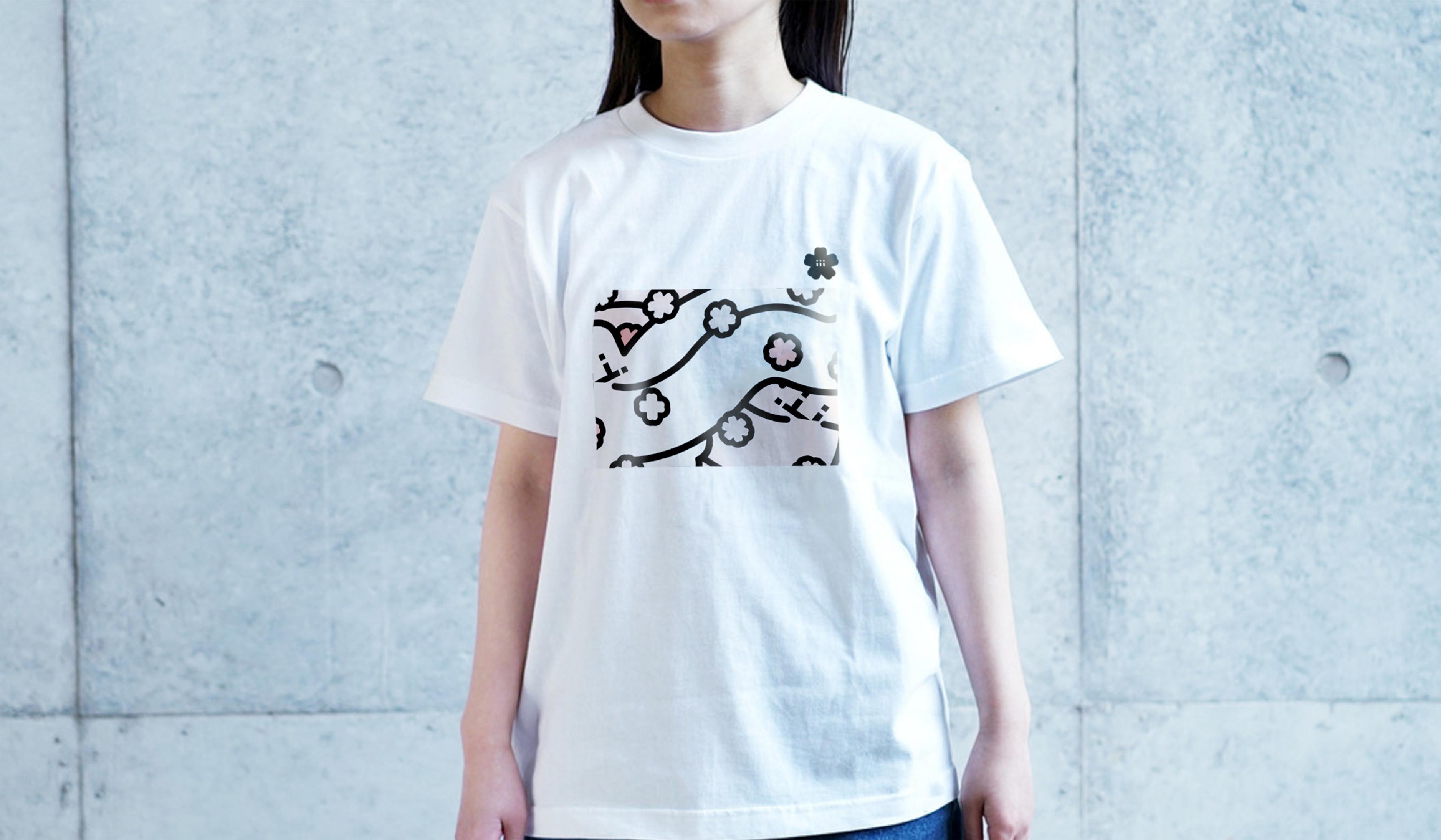
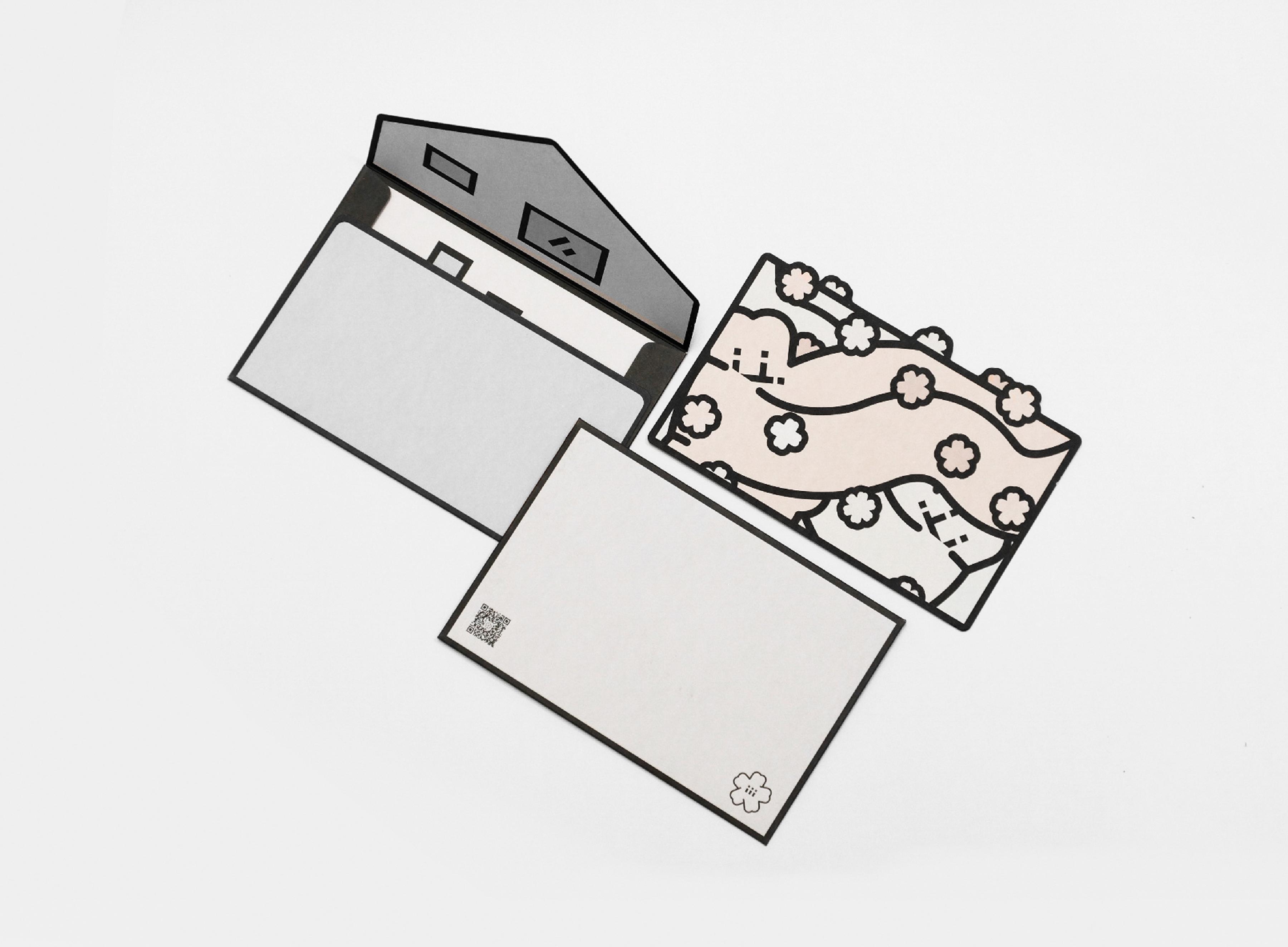
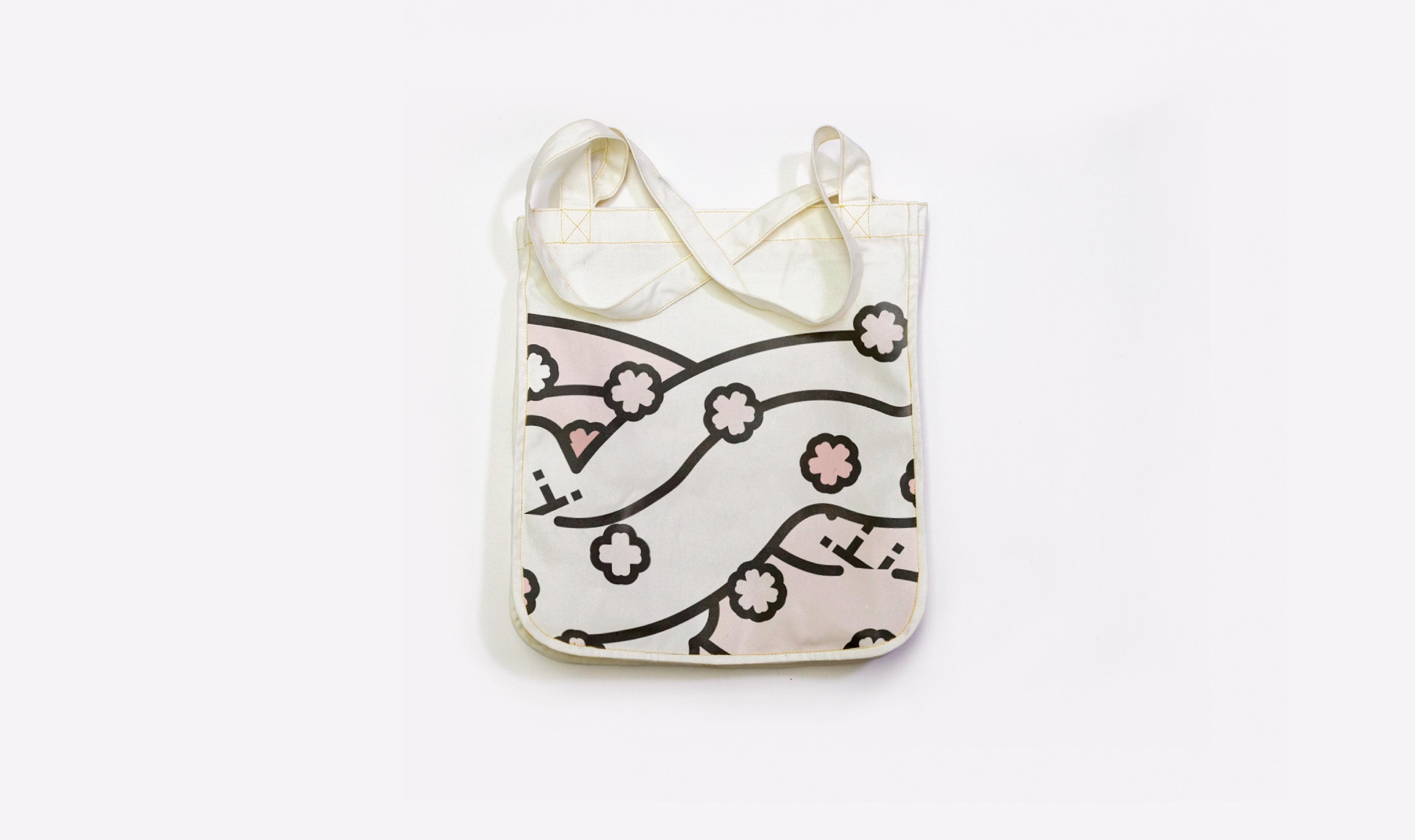
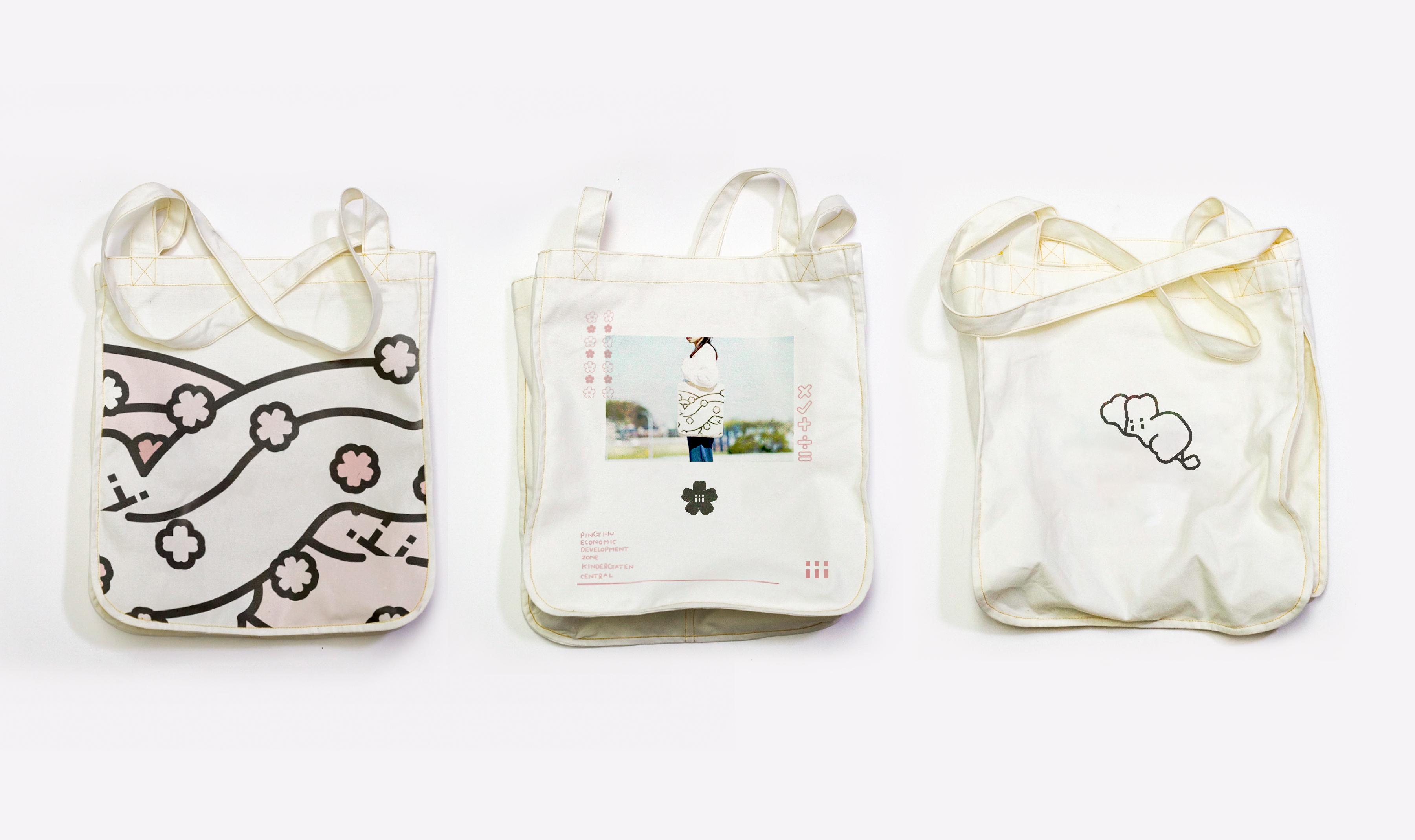
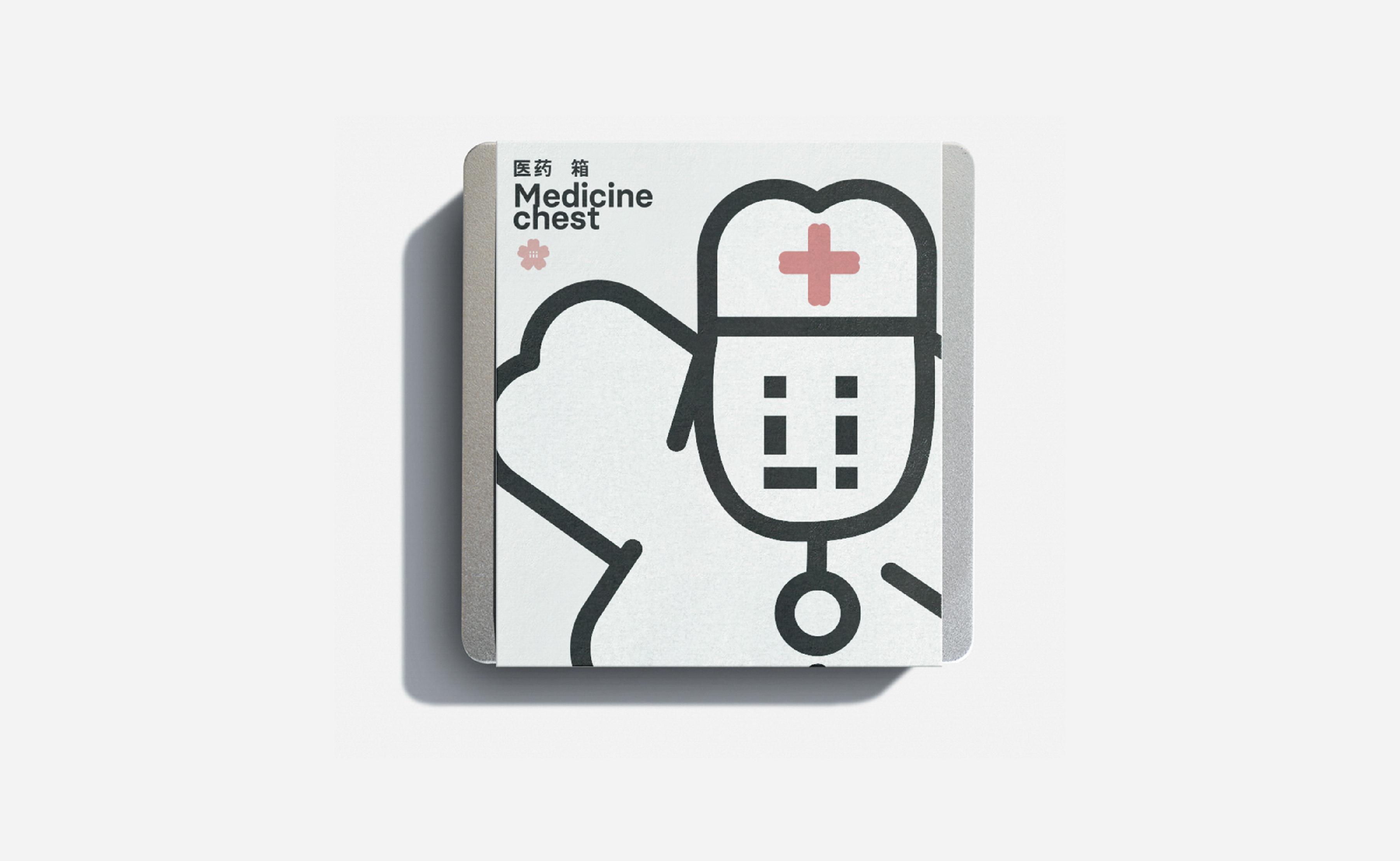
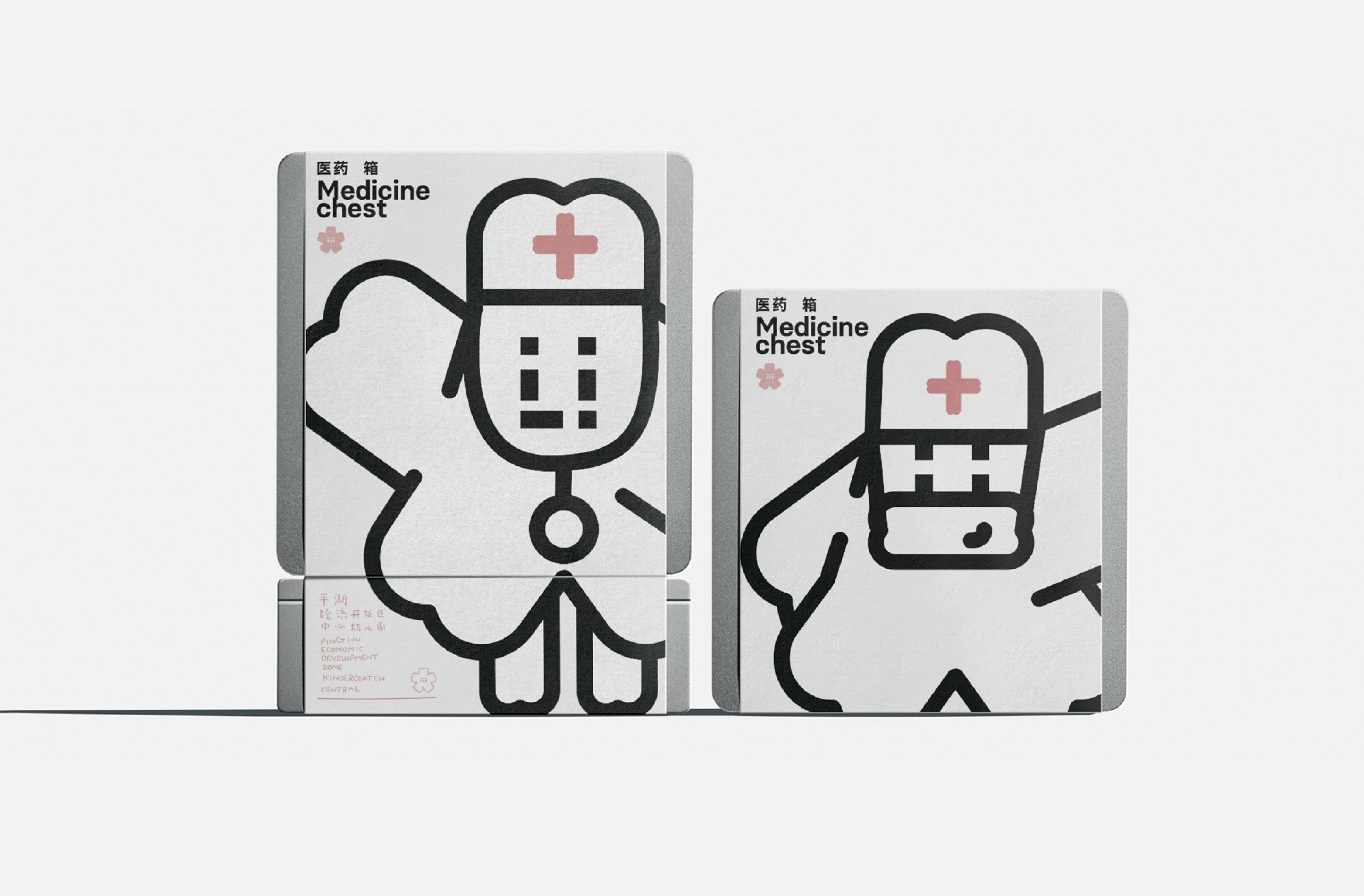
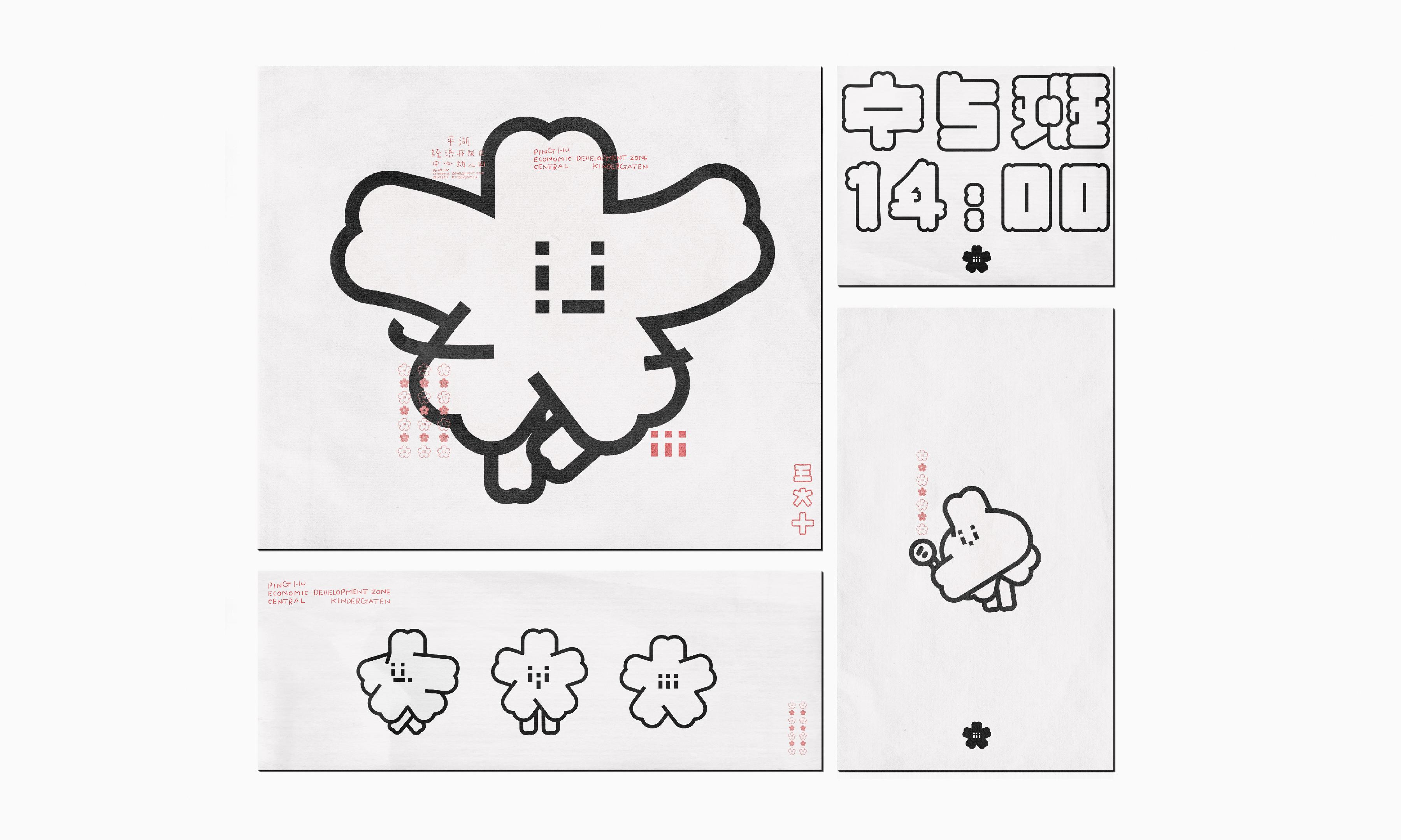
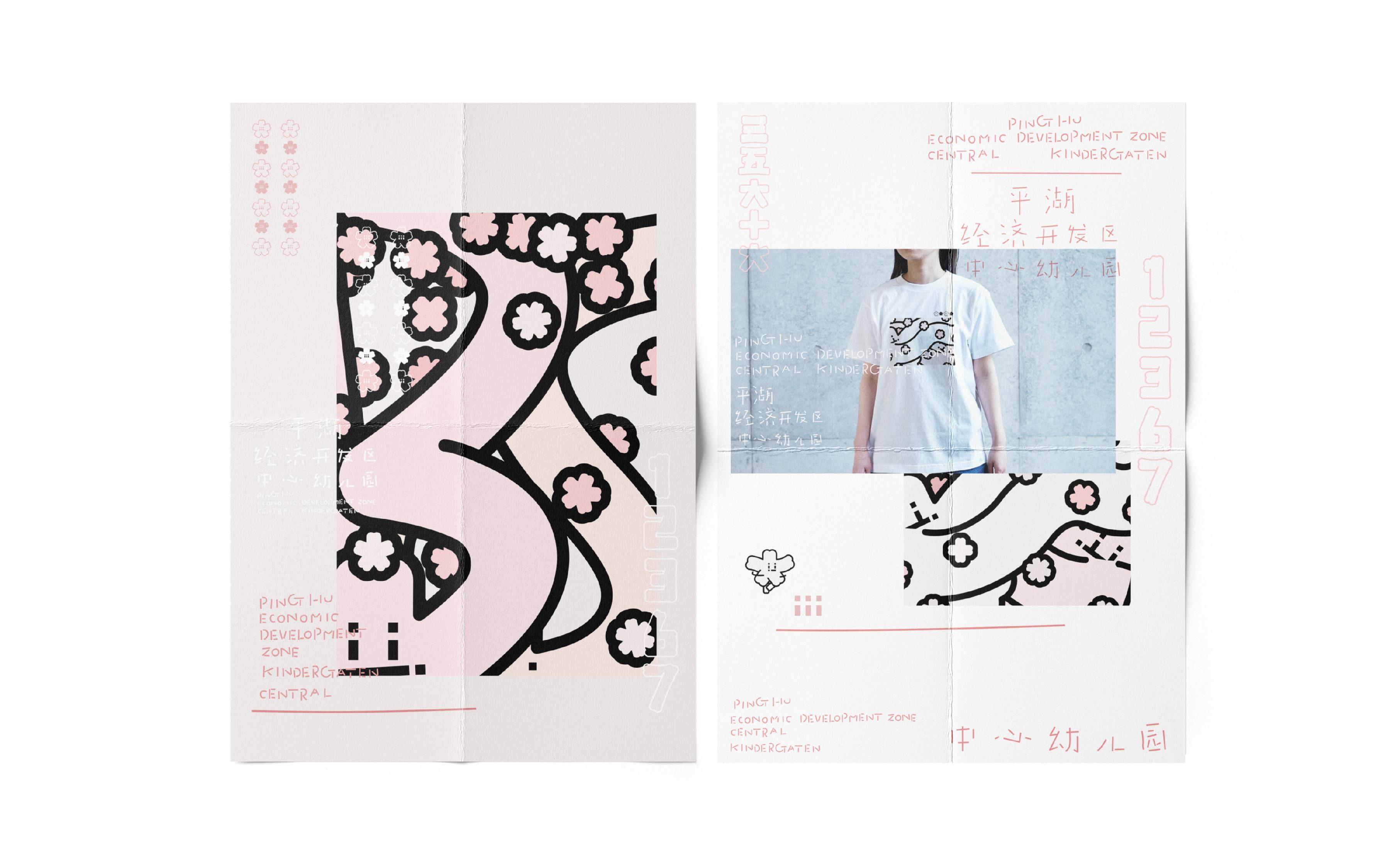
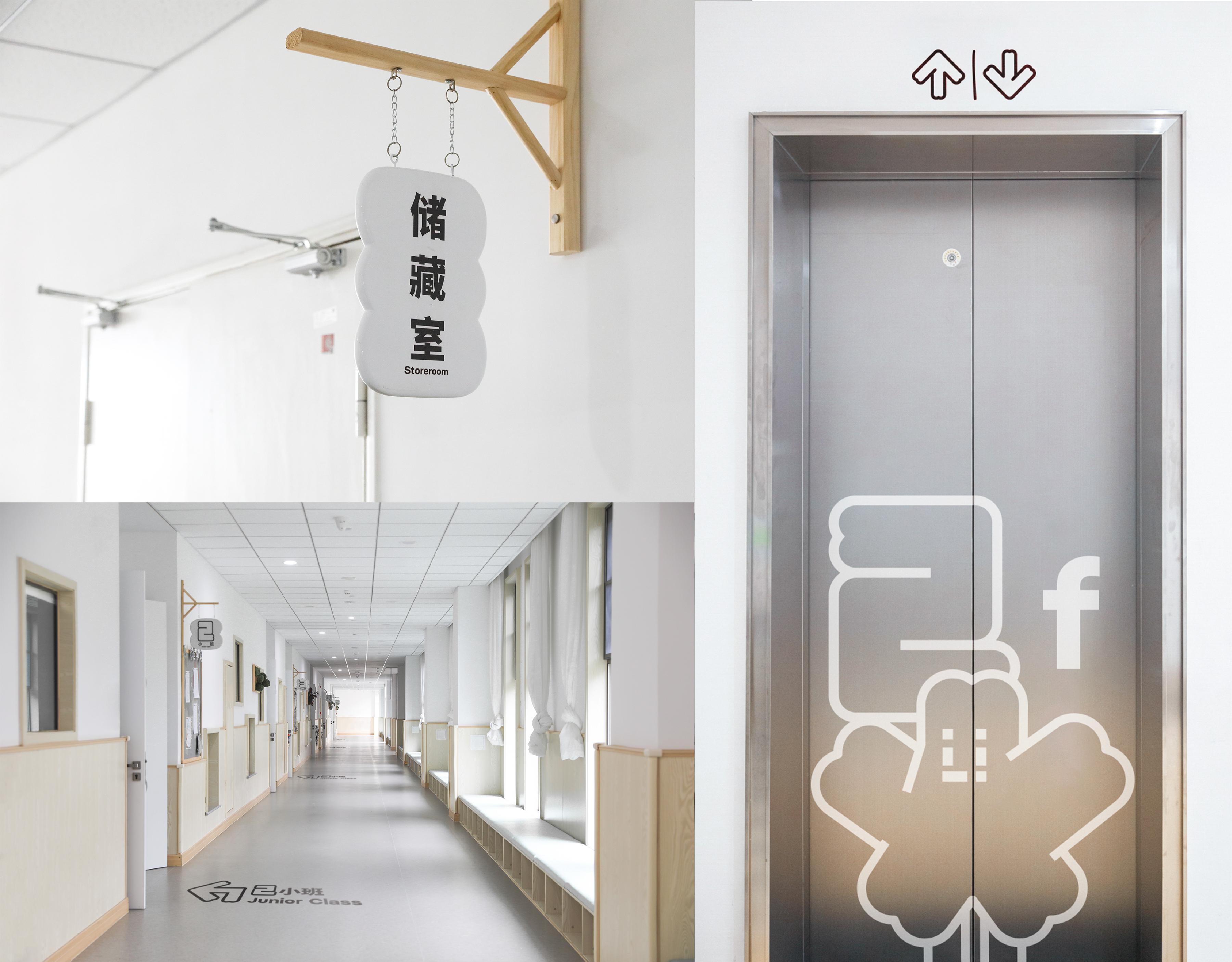
背景: 平湖市经济开发区幼儿园(新园),由同济设计院进行设计,可容纳3500名师生,是浙江省第二大的幼儿园。 园长与老师们都很喜欢活泼而不失独特性的设计语言,对商业化的设计也持开放态度。 创意: 1、在策略与资料搜集中。发现有个没有认知陈本的信息——“樱花”,樱花不仅是幼儿园的“园花”,平湖市 也是浙江省当地著名的樱花旅游地,既然已有一个大家熟知的符号,要做的是将“符号”赋予合理性。 2、我们提出“春暖花开”的概念,樱花成为方案的“前菜”(核心信息),正餐是——樱花与教育的关系。樱花 有一个不够独特但极为有用的特征——“都只有五瓣”,我国学前教育要求用“五大领域”来建设孩子们学 前教育系统。“5”让教育系统与樱花不期而遇。其次是“3”,我们将“花蕊”设计成“3”个,“3”应对学前教育 的3个最重要概念“三位一体”——孩子、家长、老师。 3、幼儿园有个特征——学生的画作贴满整个教室外墙,虽然无可厚非但无形中会让校园变得更凌乱。那么 基于园方简报需求,我们提出“系统”“干净”“活泼”的主基调。让设计“系统”,“系统”中保持“干净”,再让 “活泼”在“干净”中生长。 4、我们发现了樱花独一无二的特征——“花瓣中央有缺口”,基于这个独特性,系统的推进下去,其次去掉 了多余的色彩,让整体视觉留白更多。再者将LOGO与吉祥物结合,仅仅将花蕊下移就变成了五官表情,形 成了一整套“活泼且独特”的设计。 结果: 园长与老师们非常中意这样高度统一的设计理念,项目也得到很好落地,并得到平湖市领导的高度赞扬。 并获得: 亚洲最具影响力金奖、金点设计奖、Hiii Brand铜奖、纽约ADC和ONE SHOW的入围。 并在垂直类设计媒体与大众社交媒体累计曝光650,000-700,000。

BACKGROUND: Pinghu City Economic Development Zone Kindergarten (New Kindergarten), designed by Tongji Design Institute, can accommodate 3500 students and teachers, making it the second largest kindergarten in Zhejiang Province. The principal and teachers appreciate a lively yet unique design language and are open to commercialized designs IDEA: 1、During the strategy and data collection phase, it was discovered that there was a piece of information that was not well-known, which was “cherry blossoms.” Cherry blossoms are not only the “garden flower” of the kindergarten but also a famous tourist attraction in Pinghu City, Zhejiang Province. Since there is already a well-known symbol, the goal is to give this symbol a rational meaning. 2、The concept of “blooming in spring” was proposed, turning cherry blossoms into the “appetizer” (core information) of the design. The main course is the relationship between cherry blossoms and education. Cherry blossoms have a feature that is not particularly unique but extremely useful – they all have only five petals. In preschool education, the construction of children’s preschool education system is based on the “Five Domains.” The number “5” brings together the education system and cherry blossoms unex- pectedly. However, instead of using the number “3,” the “flower bud” design was created with “3” units to correspond to the three most important targets of preschool education – children, parents, and teachers. 3、This design project includes brand reshaping, mascot de- sign, and signage system design. Kindergartens often cover the exterior walls of classrooms with students’ artwork, which, although lively, can visually clutter the campus. Considering the large size of this kindergarten, the main theme proposed is “systematic,” “clean,” and “lively.” The overall design must be absolutely “systematic,” and under the “systematic” theme, it must be “clean,” while allowing “liveliness” to grow within the “clean” framework. 4、We further explored the unique feature of cherry blossoms – “a notch in the center of the petals” – and systematically incorporated it into the design. Additionally, unnecessary colors were removed to create more visual white space. Furthermore, the logo was combined with the mascot, and simply moving the flower bud downward created facial expressions, forming a complete set of “lively yet unique” designs. RESULT: The principal and teachers were highly satisfied with this highly unified design concept, and the project was successfully implemented, receiving high praise from the leadership of - Pinghu City. The design also won several awards and recognition, including the Asia’s Most Influential Gold Award, Golden Point Design Award, Hiii Brand Bronze Award, as well as being shortlisted for ADC and ONE SHOW in New York. It also received significant exposure in vertical design media and popular social media, accumulating an exposure rangeof 650,000 to 700,000.
