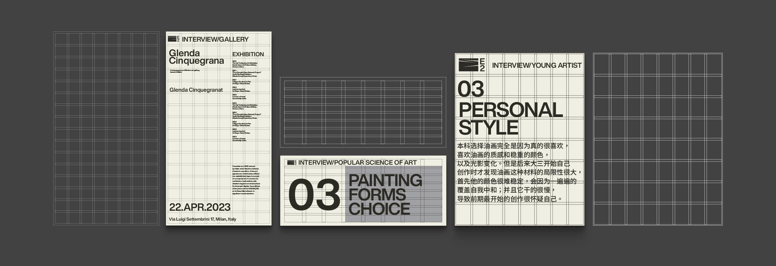
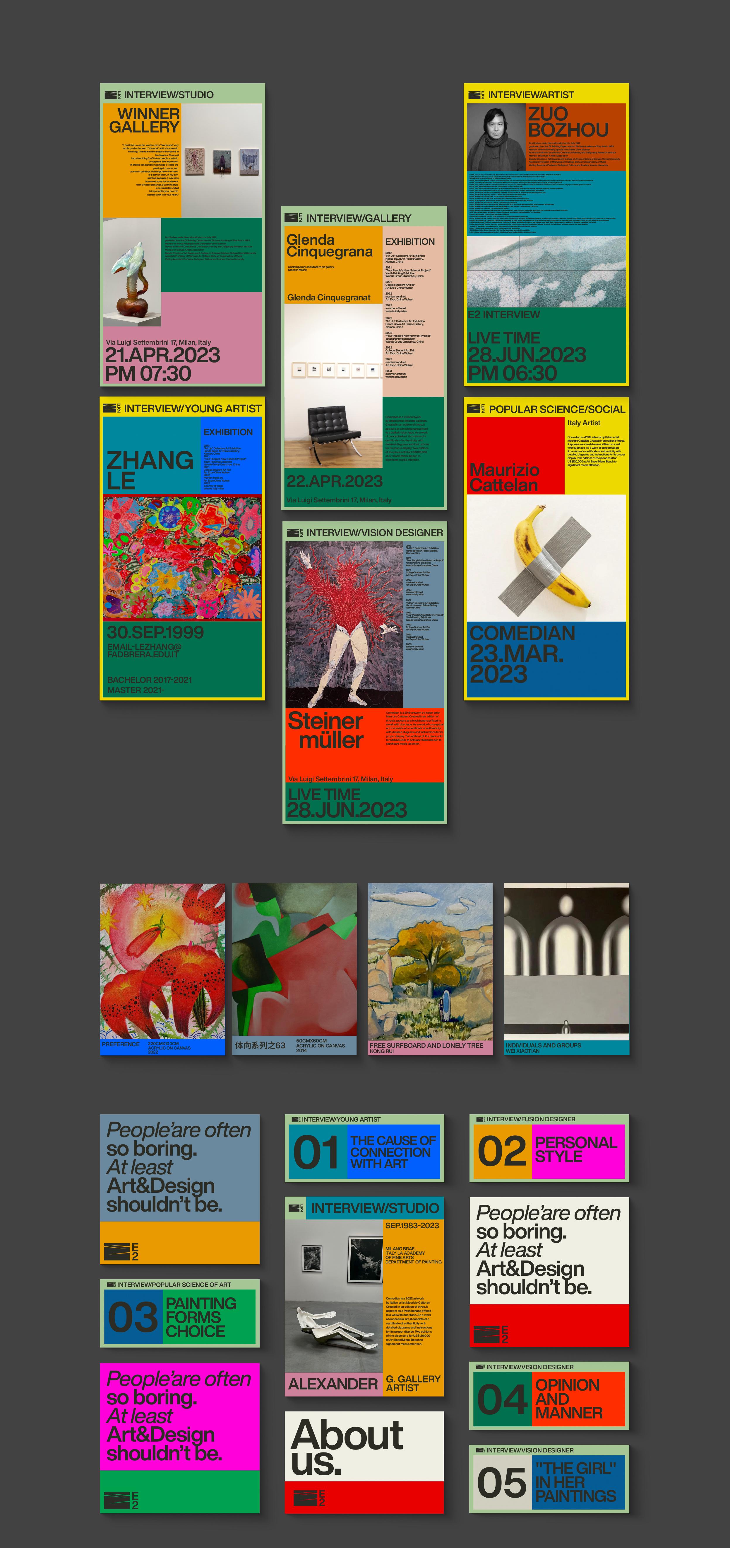
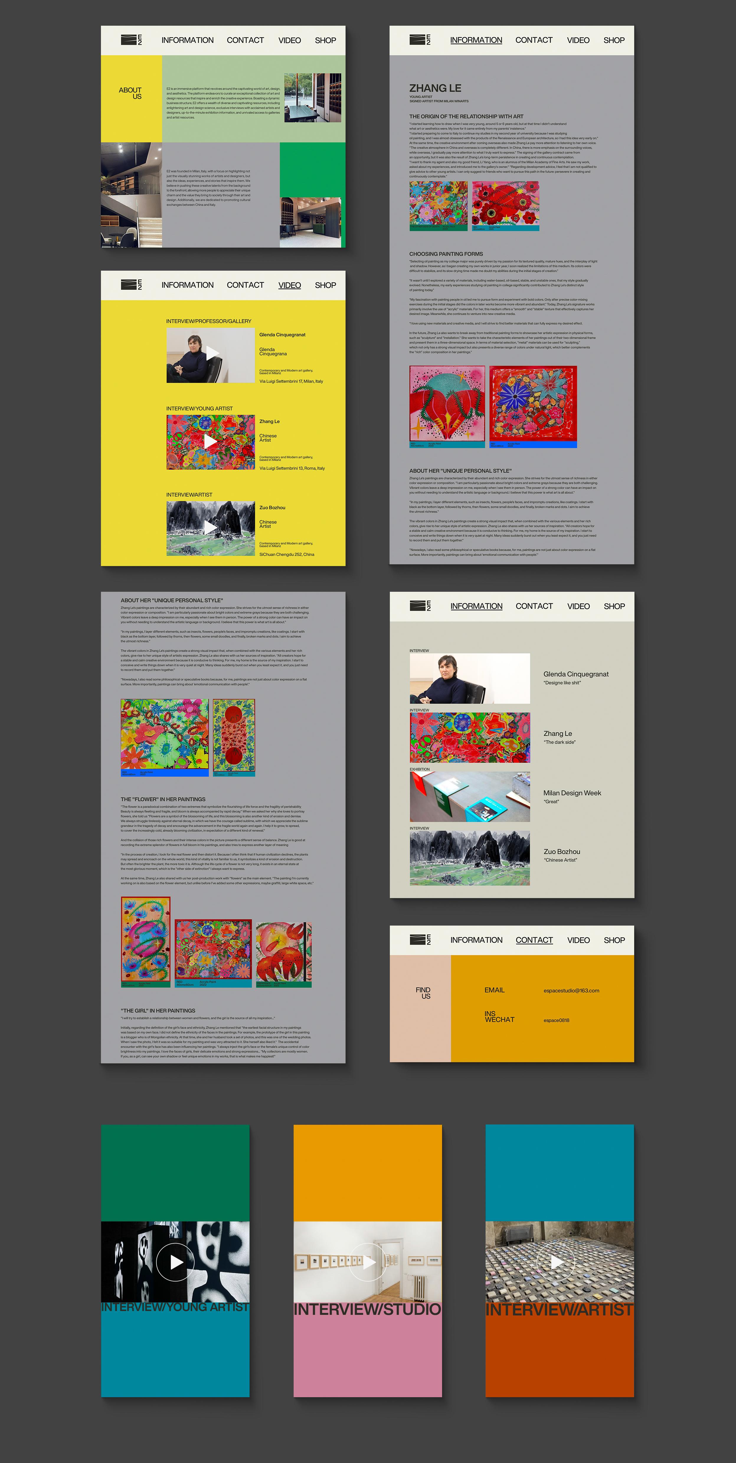
背景: E2是一个自媒体平台,成立于意大利米兰,主要负责艺术与设计的内容科普,艺术家推广以及意大利文化 介绍。希望重新打造品牌视觉,能更好的获取艺术资源及更高效的作业模式。 创意: 1、作为一个以艺术为核心的资源整合媒体平台,好看是必须品,它直接决定艺术家、艺术从业者对平台的 第一印象。第一印象很重要,品牌的“内容”一样重要,所以视觉不仅需要美观、先锋,更应该作为绿叶协助 “内容”被良好的传播。所以整体设计上不能喧宾夺主,简洁、功能性是基调。 2、在不同的设计媒体上侧重点不一样,抖音、TIKTOK、小红书、Instagram、微信公众号、微信视频号、 YouTube等,导致即使内容一样也要有所区分。很繁杂,是这次品牌设计最大的难点。我们利用时尚的 颜色搭建矩形,再用矩形对信息进行归纳。 3、大多数自媒体公司有个特点,人手少且流动大,缺乏专业人员,所以盛产多面手,所以客户要求制作 一套“傻瓜式”的设计规范,能让人人都做出设计的规范。于是我们制作了网格系统,并对客户进行了一定 的培训。
BACKGROUND: E2 is a self-media platform established in Milan, Italy, primarily responsible for popularizing content on art and design, promoting artists, and introducing Italian culture. It aims to red- esign its brand visual identity to better access art resources and operate more efficiently. IDEA: 1、As a media platform that integrates resources with art at its core, aesthetics are essenti- al. They directly influence the first impression of artists and art practitioners towards the platform. The first impression is crucial, and the brand's "content" is equally important. Therefore, the visual aspect should not overshadow the content; simplicity and functionality are the key tones. 2、Different design media platforms have different emphases, such as Douyin, TikTok, Xiao- hongshu, Instagram, WeChat Official Accounts, WeChat Video Accounts, YouTube, etc., lead- ing to the need for differentiation even when the content is similar. This complexity poses the biggest challenge to this brand design. We utilize fashionable colors to construct recta- ngles, which are then used to categorize information. 3、Most self-media companies have a characteristic of having few employees and high turn- over, lacking professional staff, resulting in a high demand for versatile individuals. There- fore, clients require a set of "foolproof" design specifications that everyone can follow. Consequently, we created a grid system and provided certain training to the clients.


