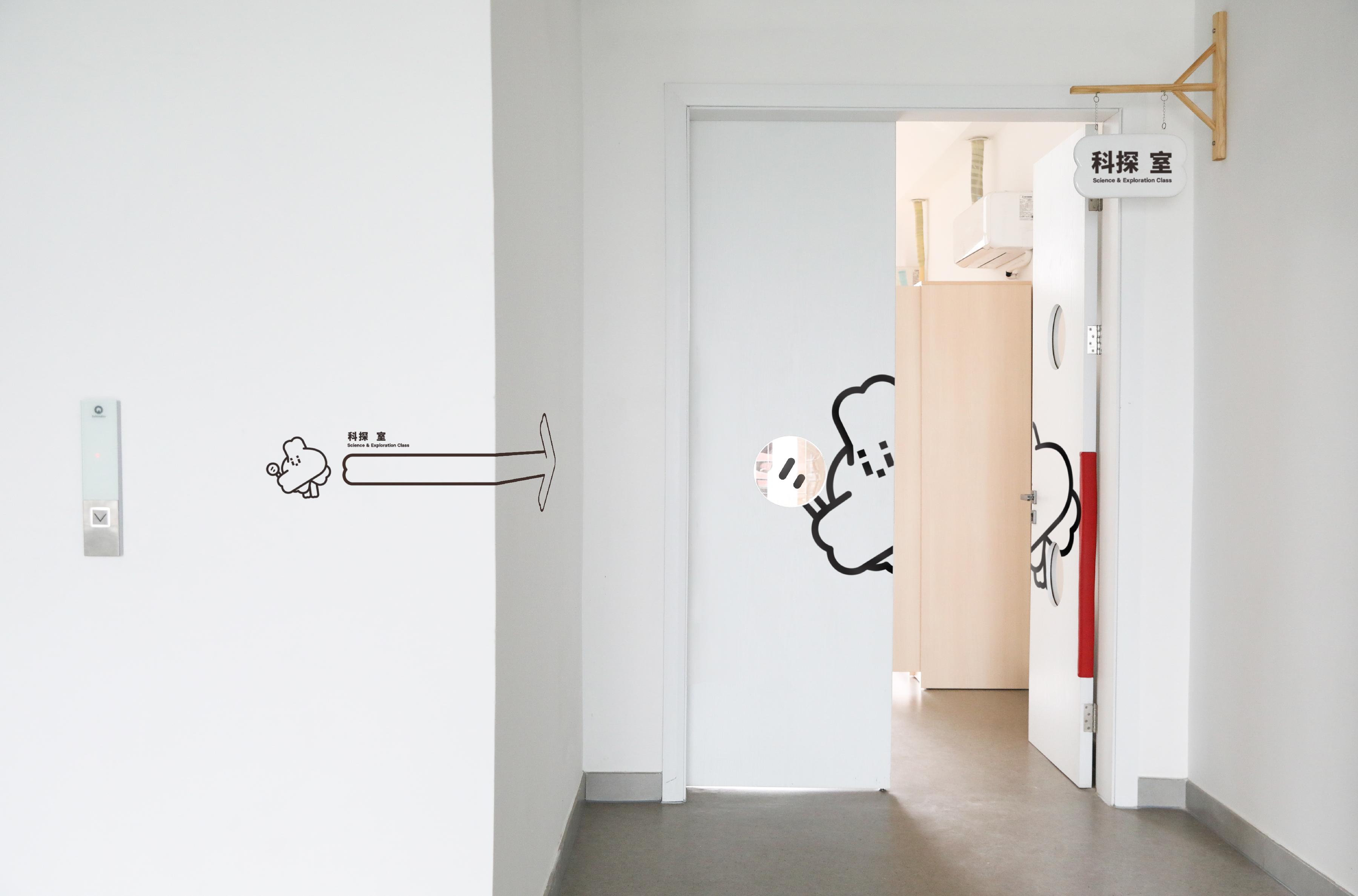
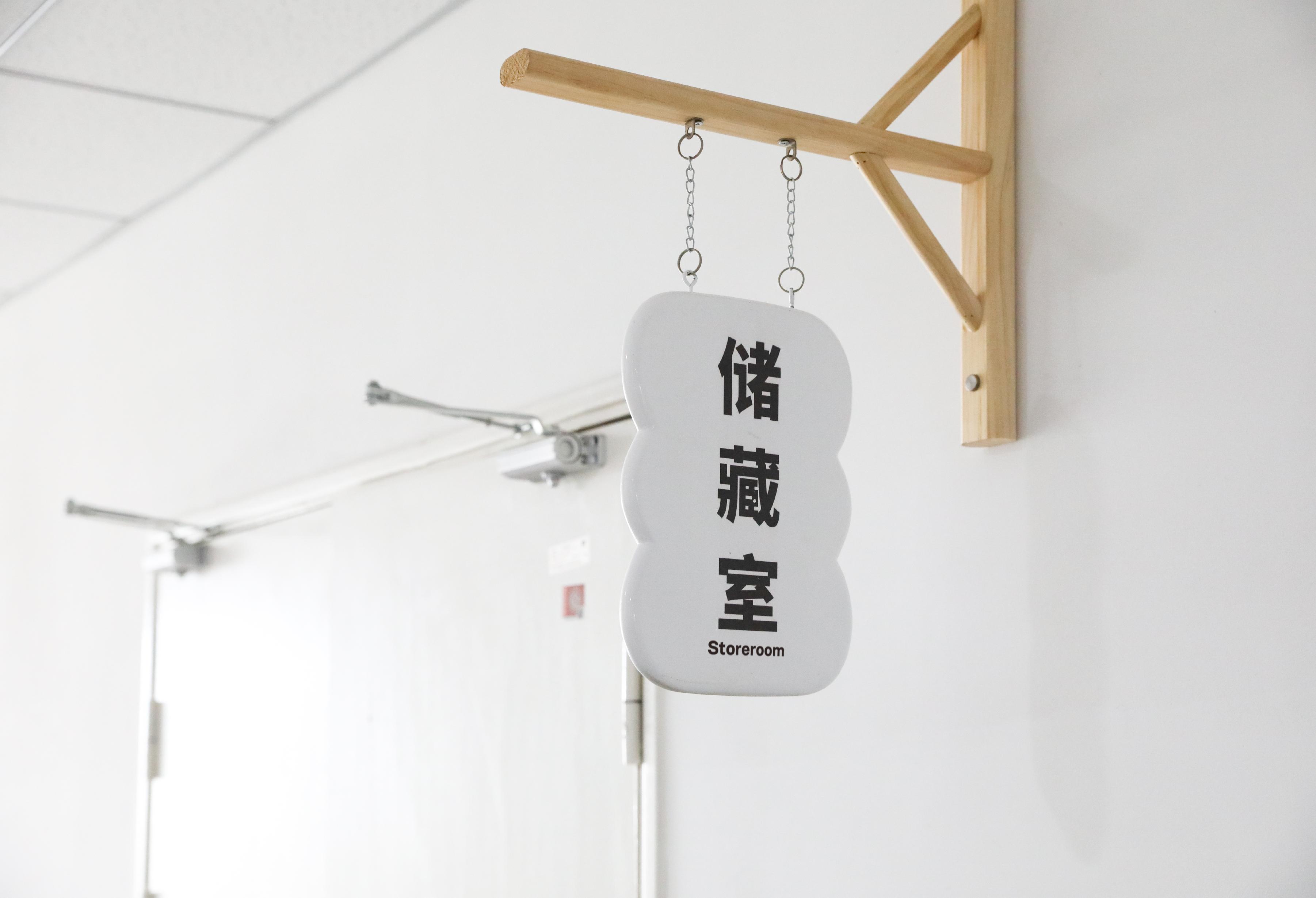
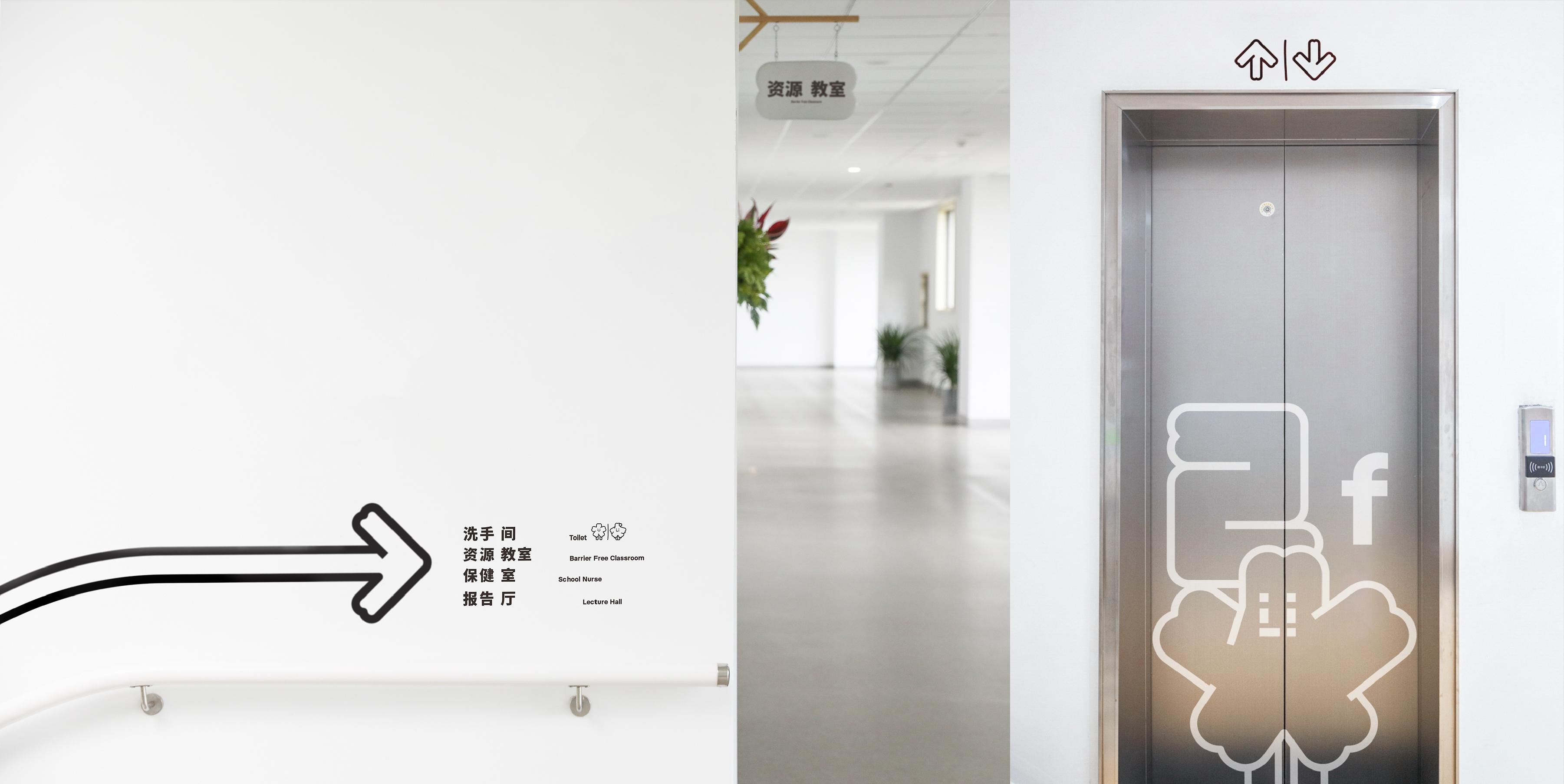
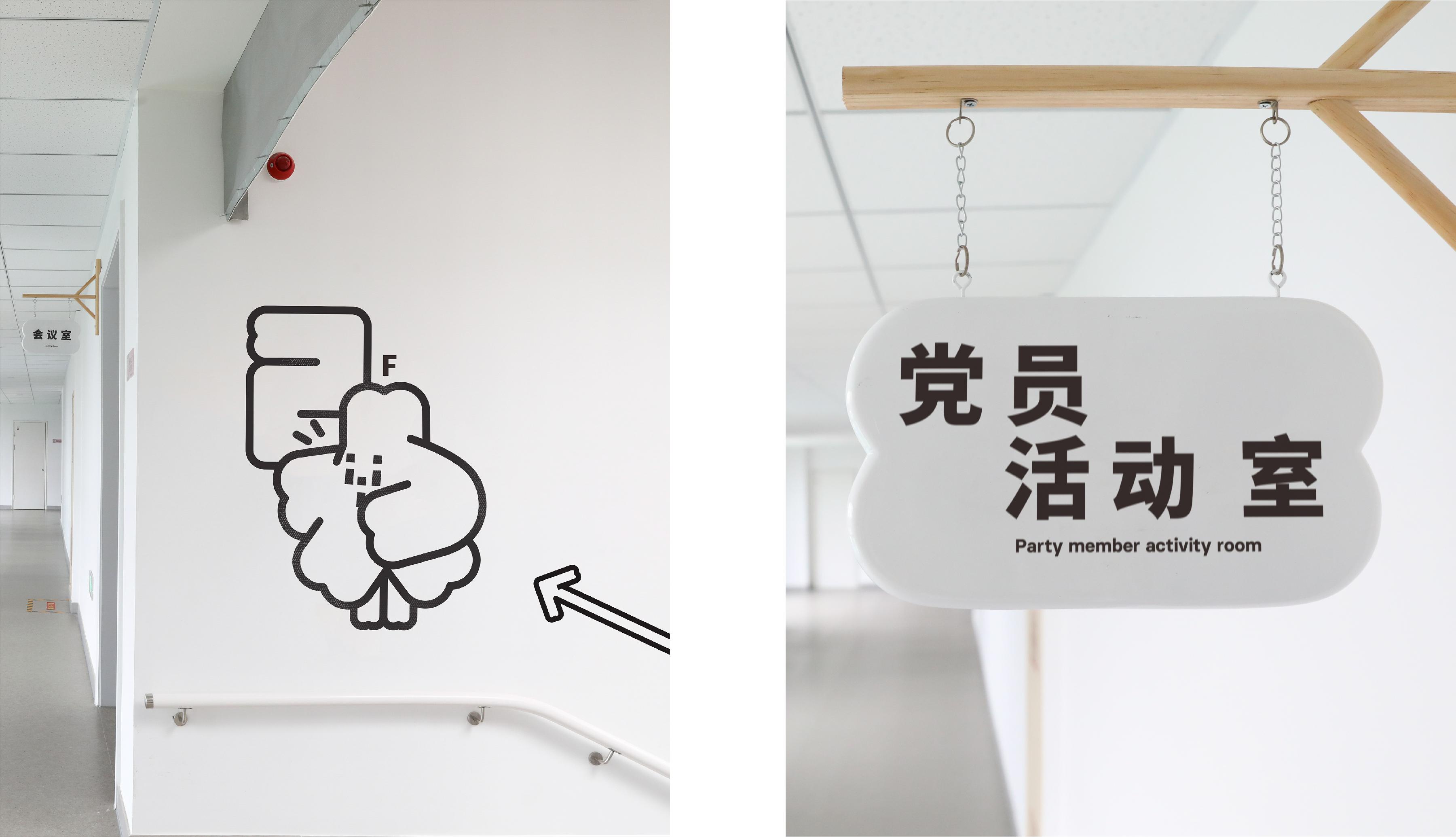
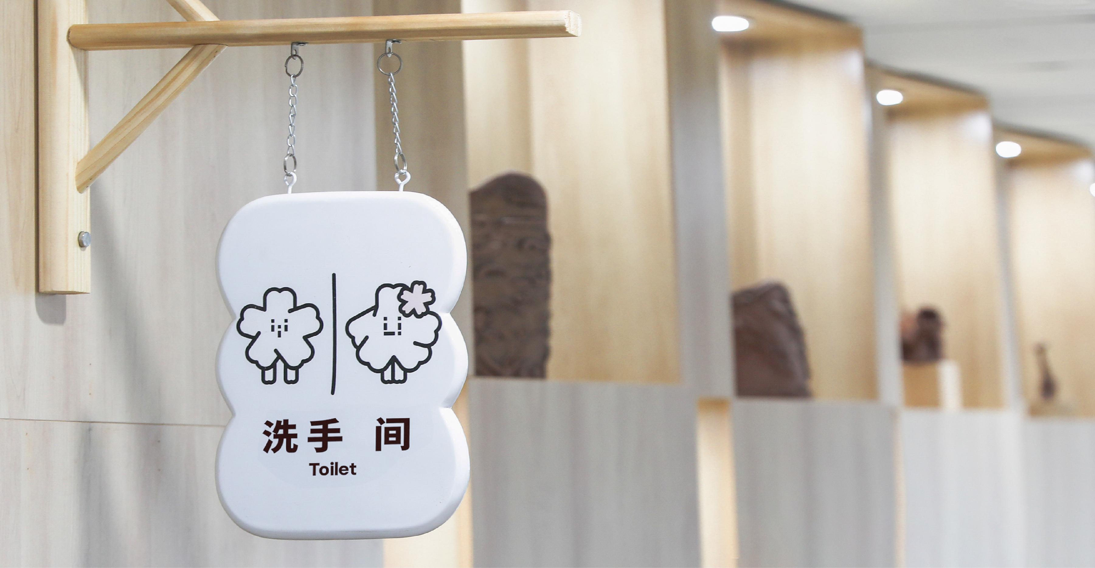
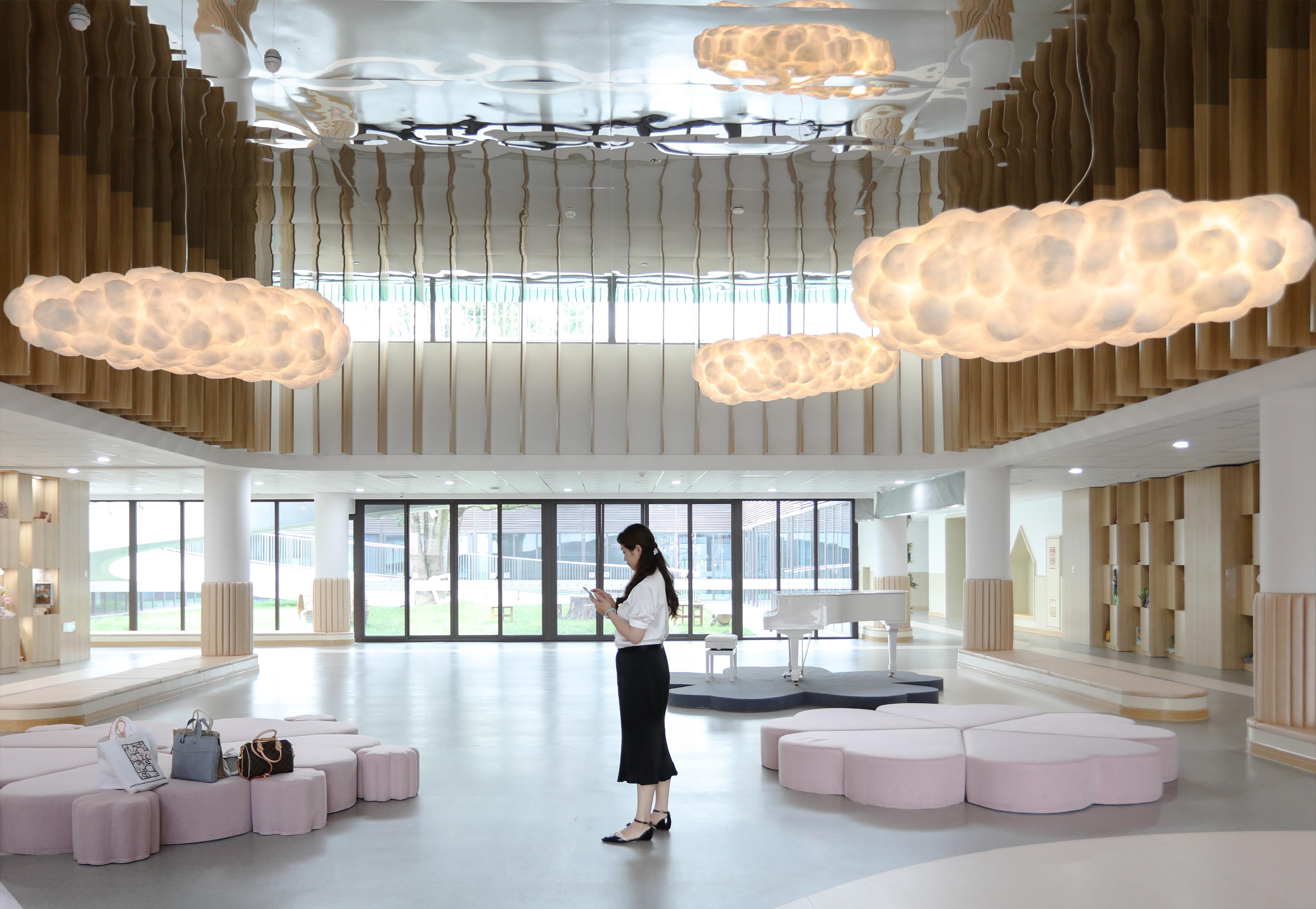
背景: 平湖经开幼儿园的特点是可容纳人数众多且为浙江省第二大幼儿园。那么空间对人的可容纳度,并非仅 用“大房子”的逻辑就能解决。不仅如此,幼儿园与成人、甚至是小初中教育最大的区别在于——可展示性、 多样化、探索性、感知性。例如:孩子们的课堂习作、手工内容,经常在教室以及公共区域中进行展示。幼儿 园导视设计有个明显特征,外形需符合童趣,内容却是给成年人看的。但在如此庞大的幼儿园里,导视系 统功刻板印象也会发生了一定变化。 创意: 1、由于幼儿园使用的特殊与繁复性,导视系统不应该做加法,让空间更加拥挤,应该有更多的留白,让人 能聚焦在孩子们的作品展示中。整体设计很简洁,没有多余的色彩,但吉祥物插图的应用让设计不失��童趣。 2、学前教育的孩子对于导视系统是陌生的,很多时候是由老师带领去往目的地,而平湖经开幼儿园占地 面积极大,如果孩子走丢,那么就无法辨认方位,所以在导视牌的背面我们绘制了孩子们能看懂的插画, 帮助孩子辨认和寻找方向。 3、导视牌的设计延续了VI设计中的“樱花”这一概念,将导视牌的外轮廓设计成了“樱花花瓣”。让VI与导 视系统至上而下,形成系统化。
BACKGROUND: Pinghu Economic Development Kindergarten is characterized by its ability to accommodate a large number of people and is the second largest kindergarten in Zhejiang Province. However, the capacity of space for people is not only solved by the logic of "big houses". Moreover, the biggest difference between kindergarten and adult or even primary and middle school education lies in the demonstrativeness, diversity, exploratory nature, and perceptiveness. For example, children's classroom compositions and handicraft contents are often displayed in classrooms and public areas. The wayfinding design of the kindergarten has a distinct feature: the appearance should be appealing to children, but the content is meant for adults. However, in such a huge kindergarten, the rigidity of the wayfinding system may undergo certain changes. IDEA: 1、Due to the special and complex nature of kindergarten use, the wayfinding system should not add clutter to the space but should leave more whitespace to focus on children's artwork displays. The overall design is very simple, without unnecessary colors, but the application of mascot illustrations keeps the design playful. 2、Preschool children are unfamiliar with wayfinding systems, often relying on teachers to lead them to their destinations. As Pinghu Economic Development Kindergarten occupies a large area, if a child gets lost, they may not be able to recognize directions. Therefore, we have drawn illustrations on the back of the wayfinding signs that children can understand, helping them identify and find directions. 3、The design of the wayfinding signs continues the concept of "cherry blossoms" in the VI design, shaping the outer contour of the wayfinding signs into "cherry blossom petals". This ensures the integration of VI and wayfinding systems from top to bottom, forming a system- atic approach.


