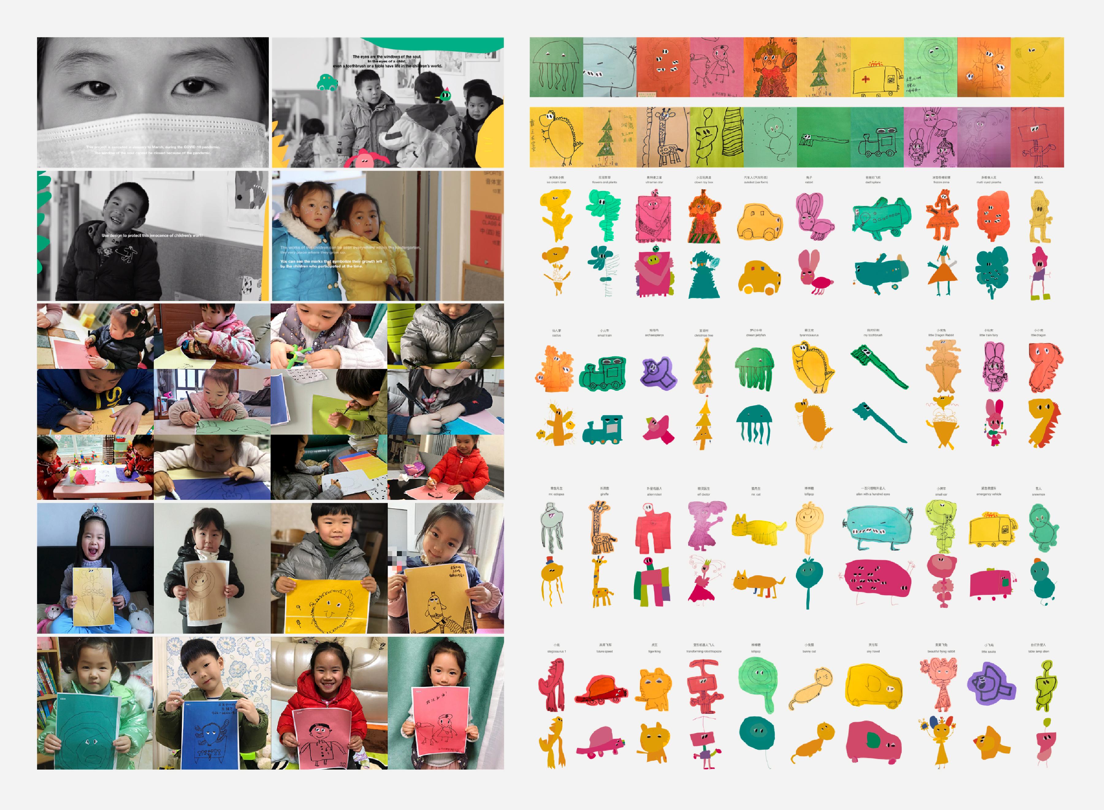
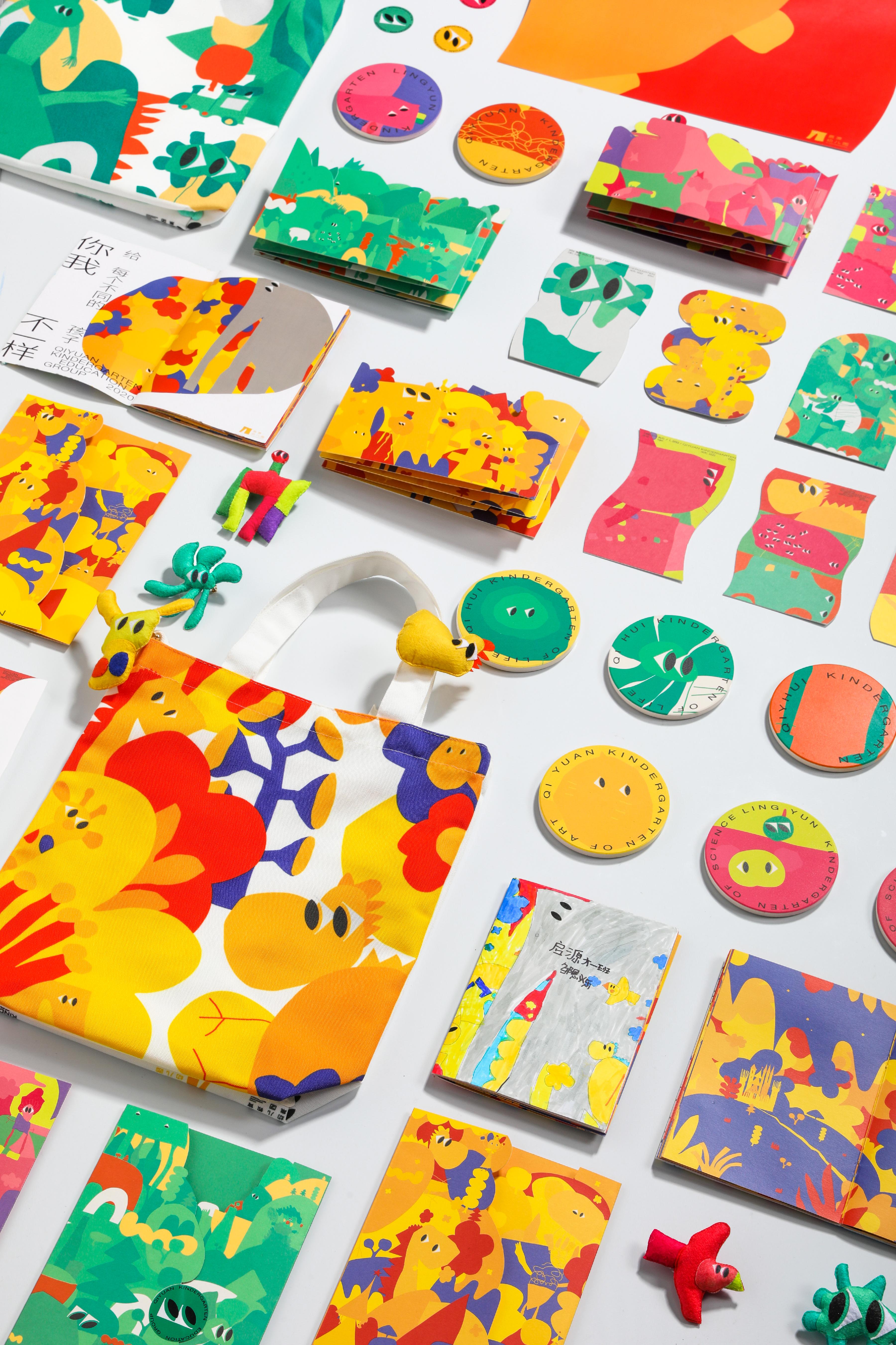
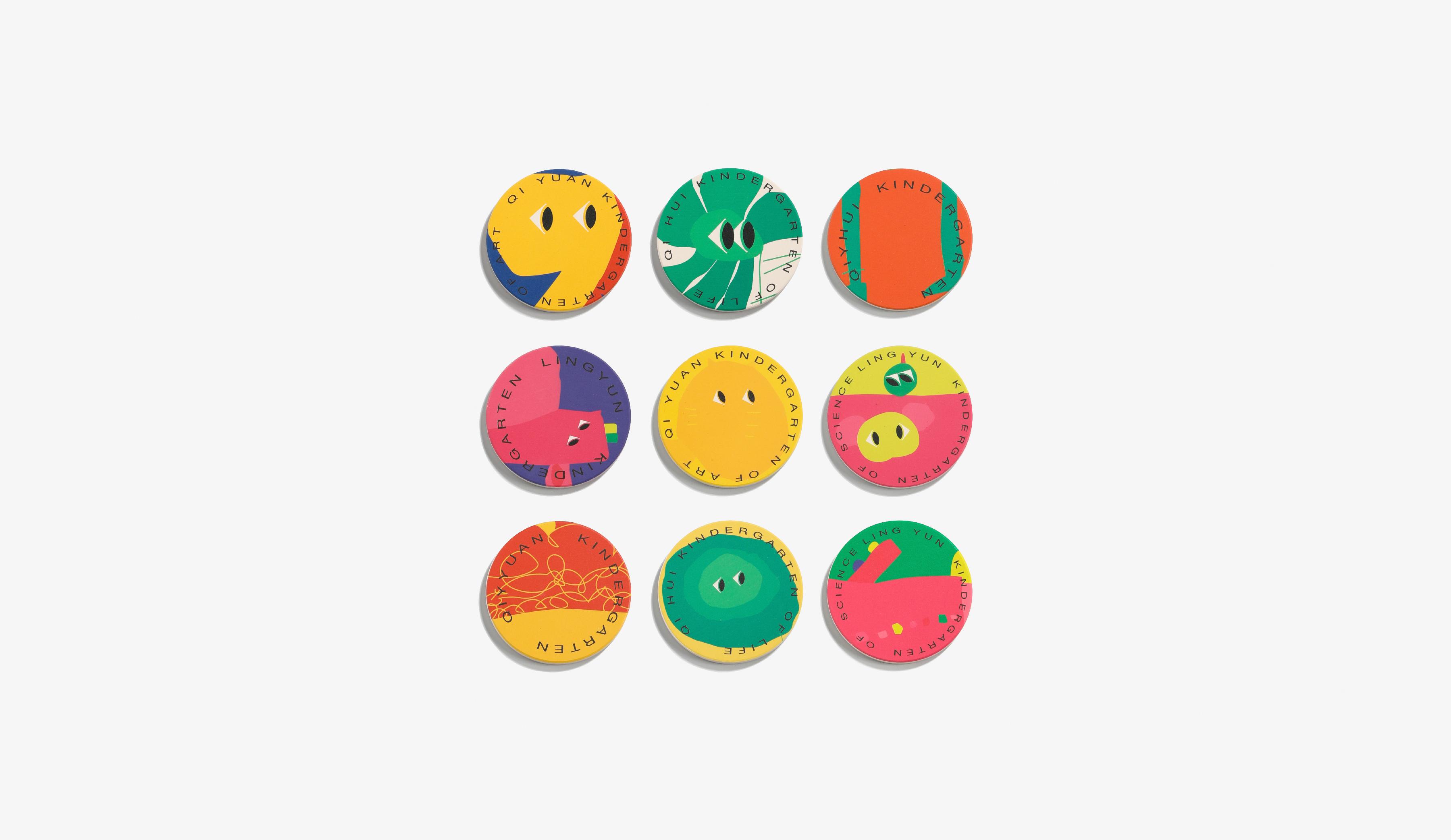
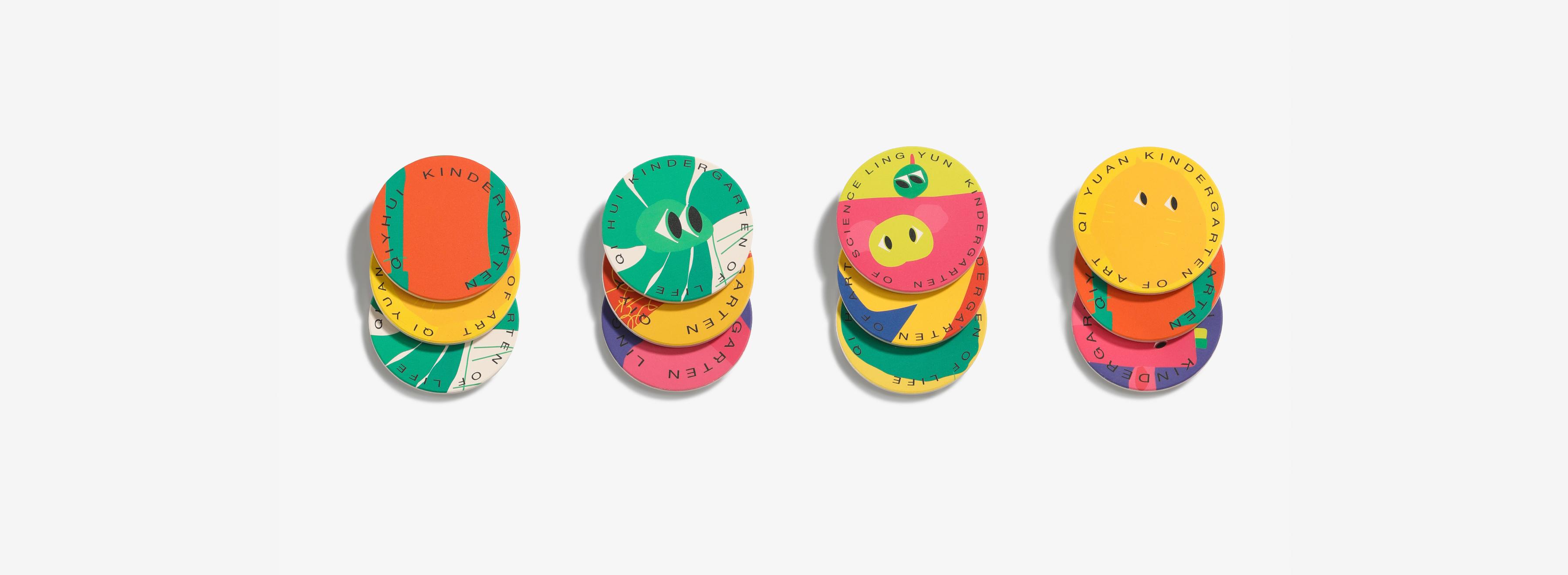
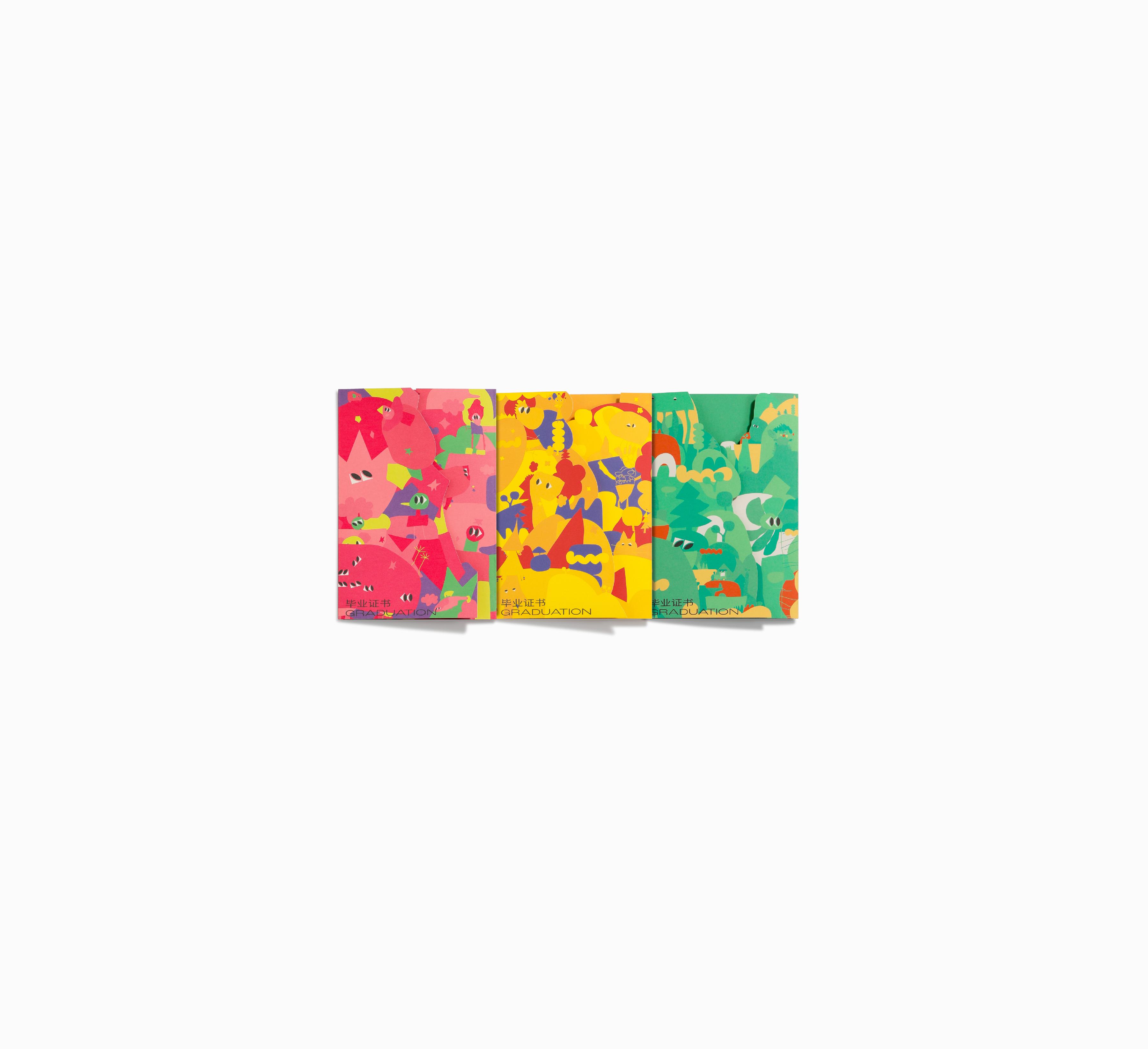
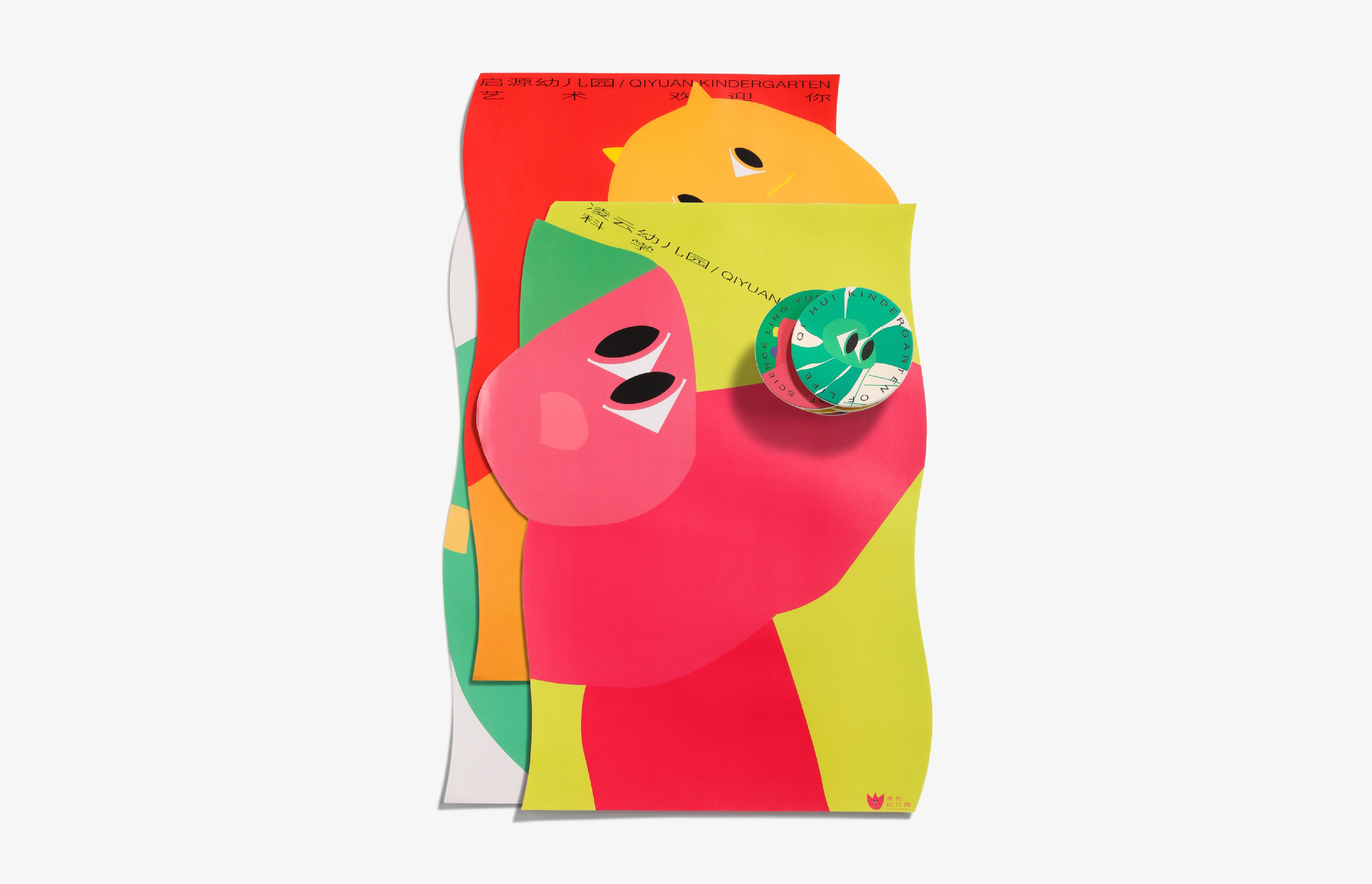
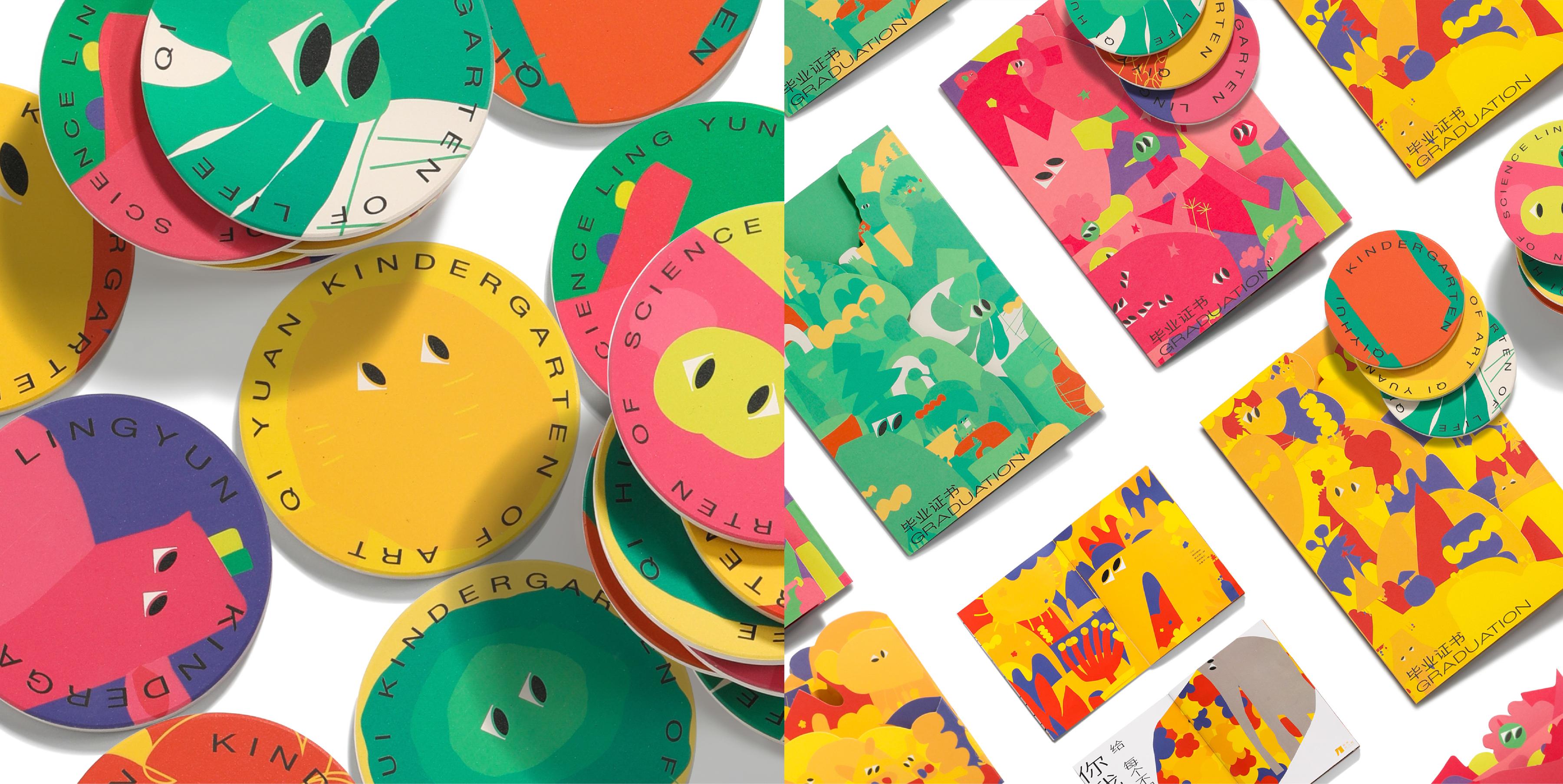
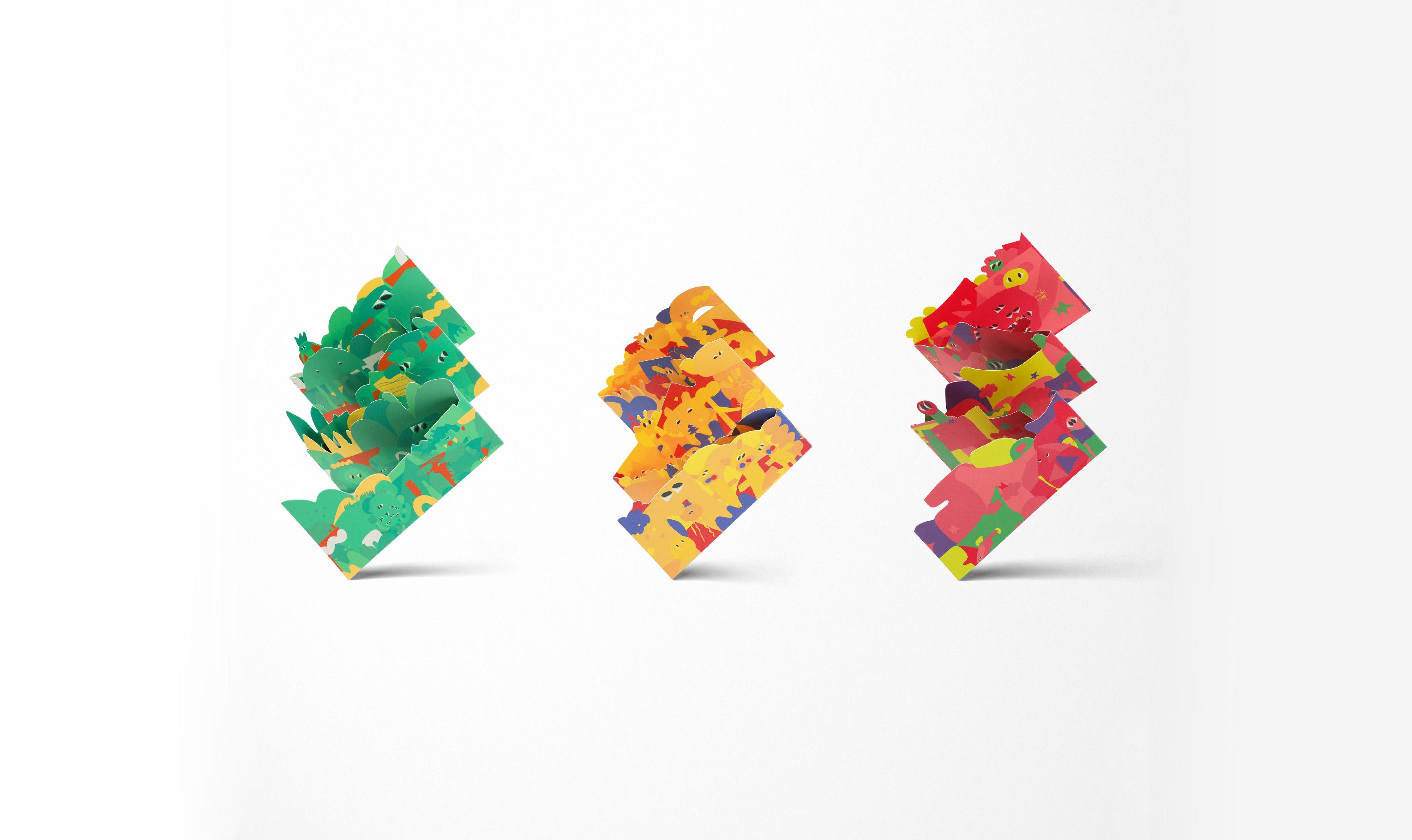
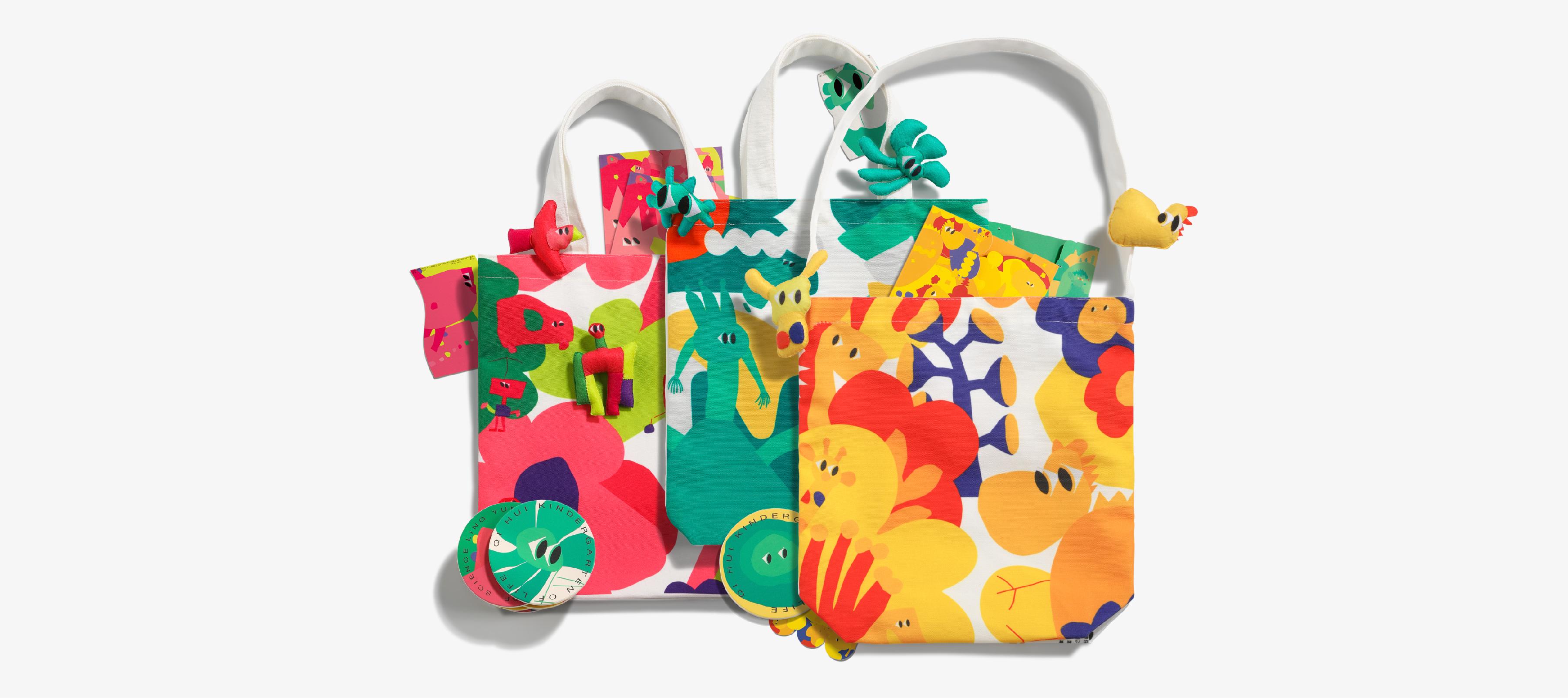
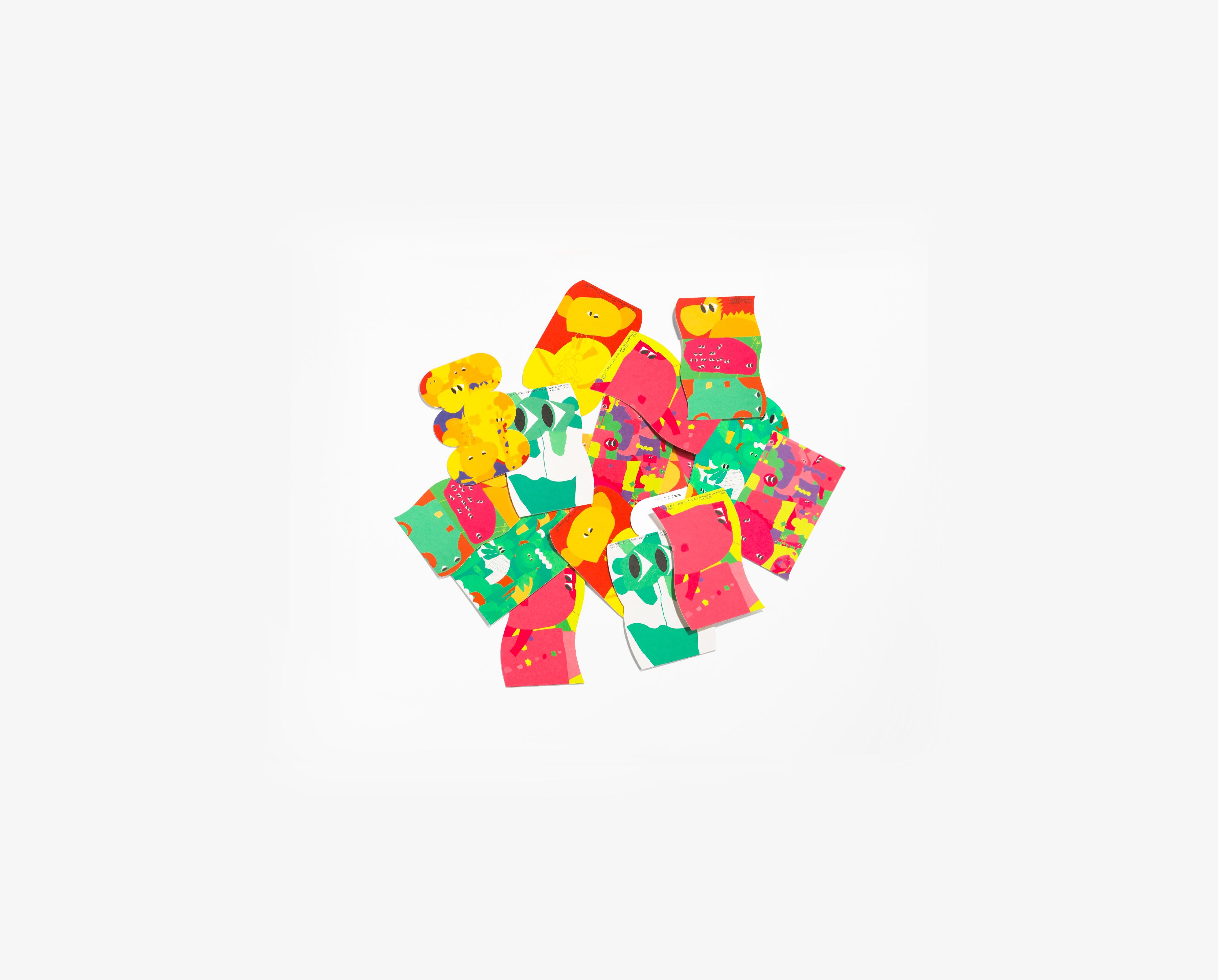
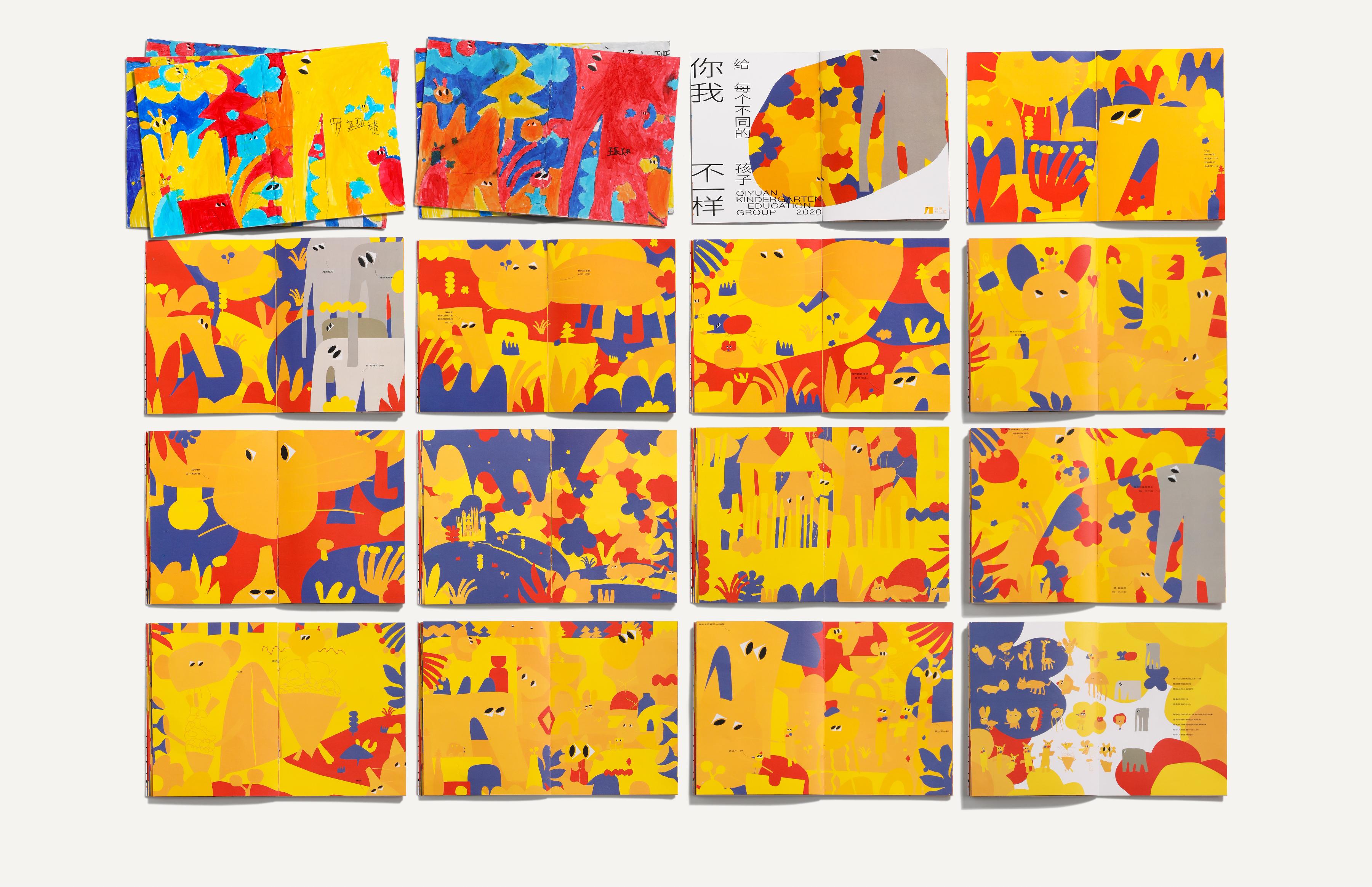
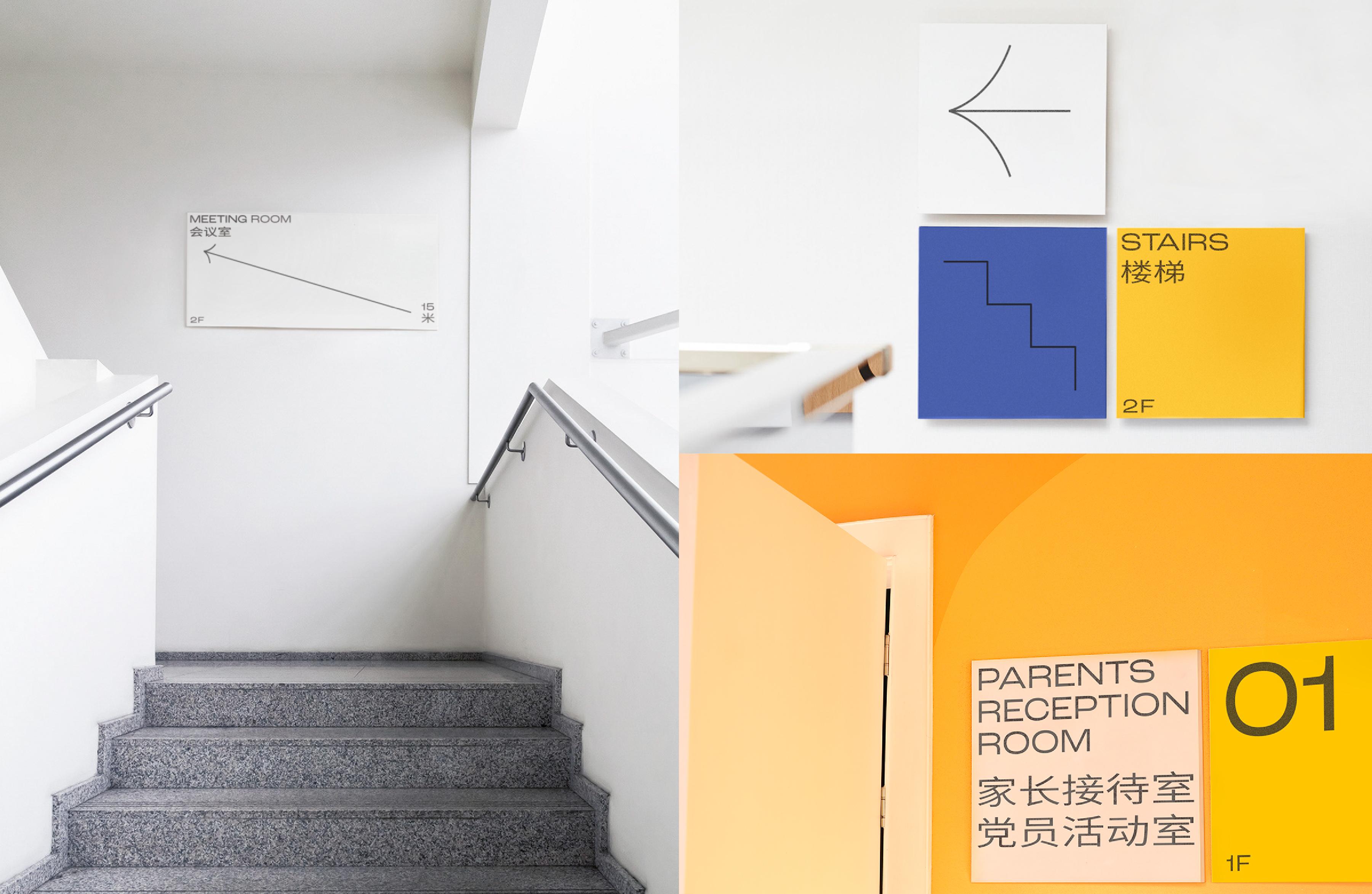
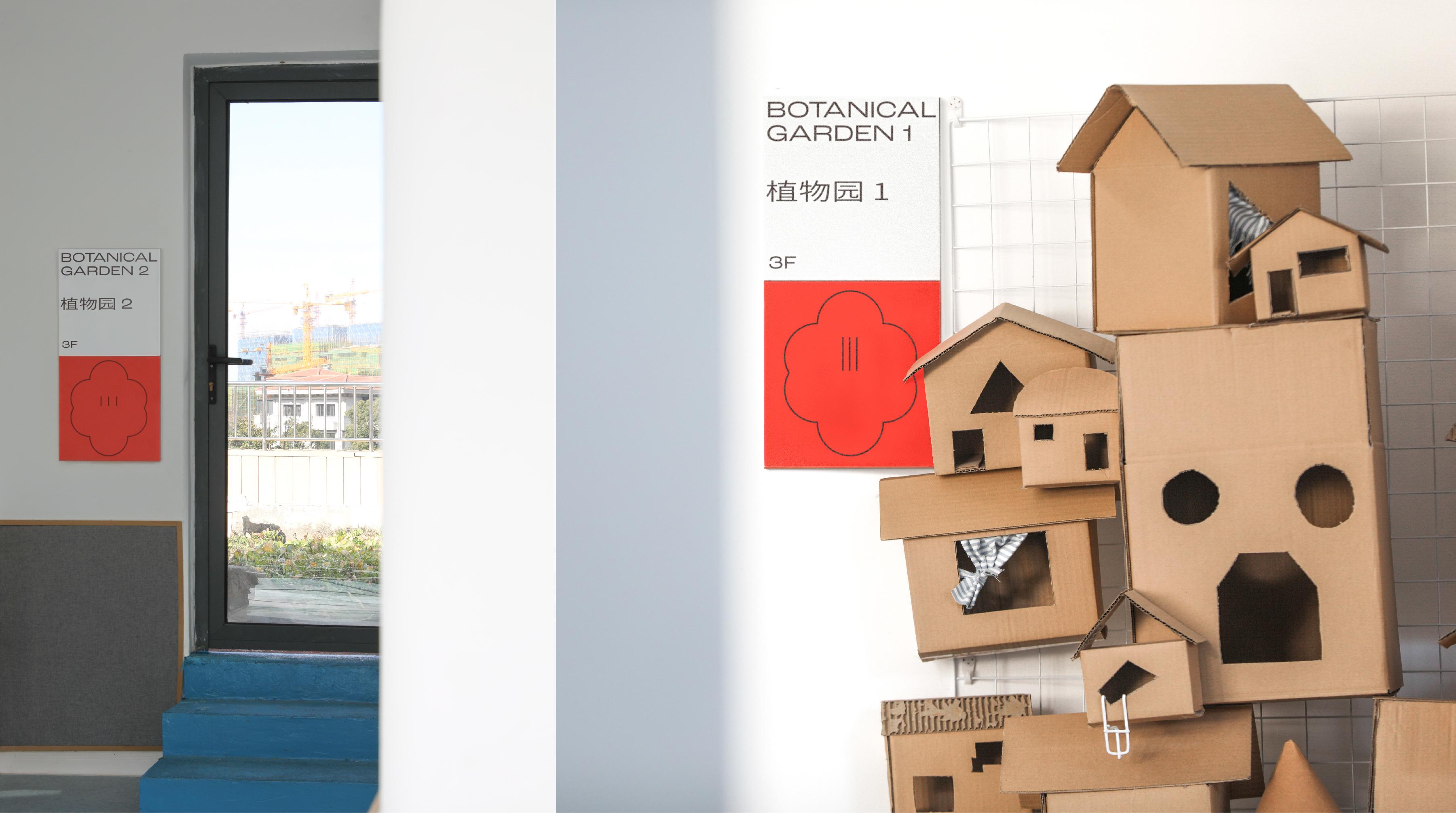
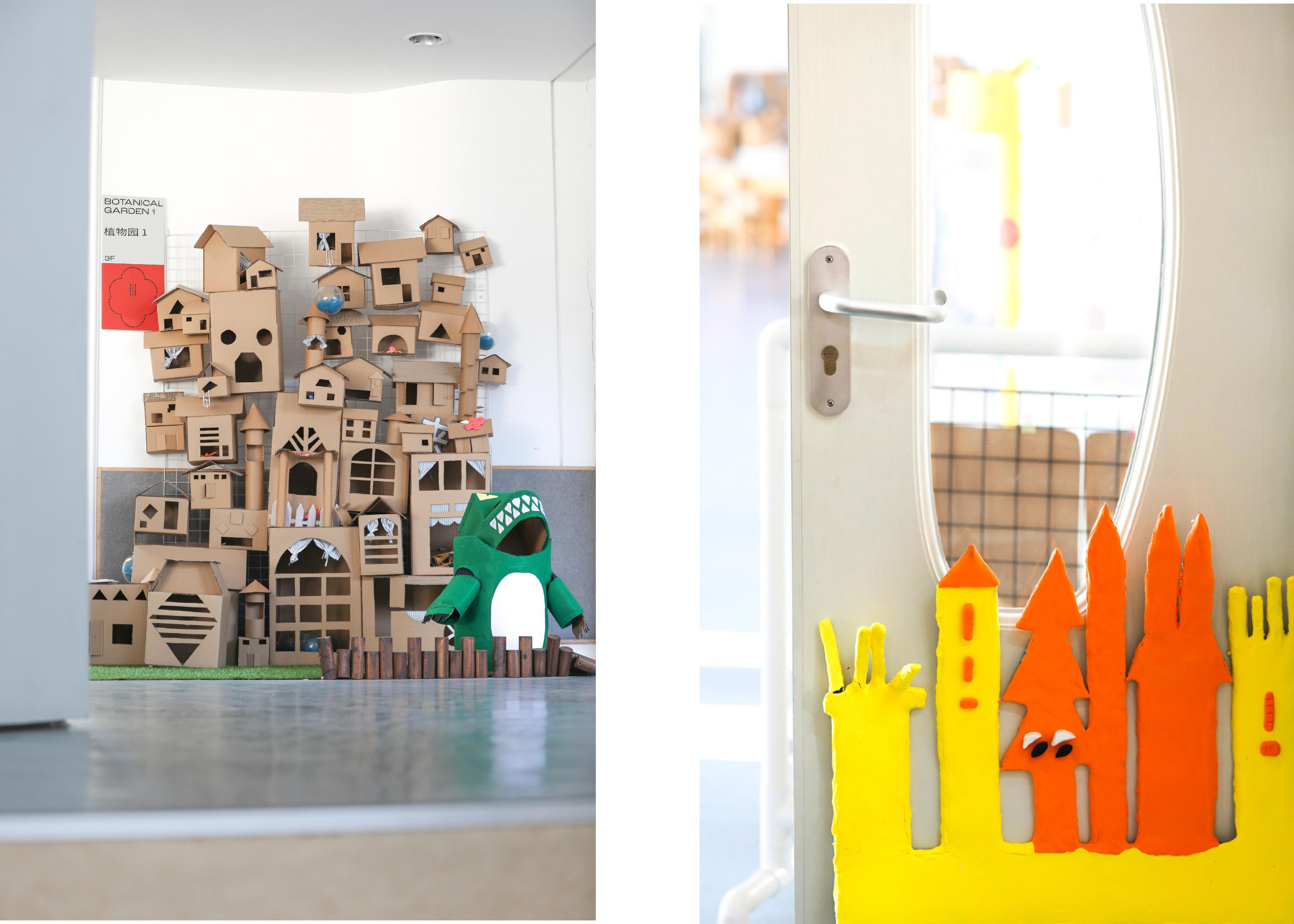
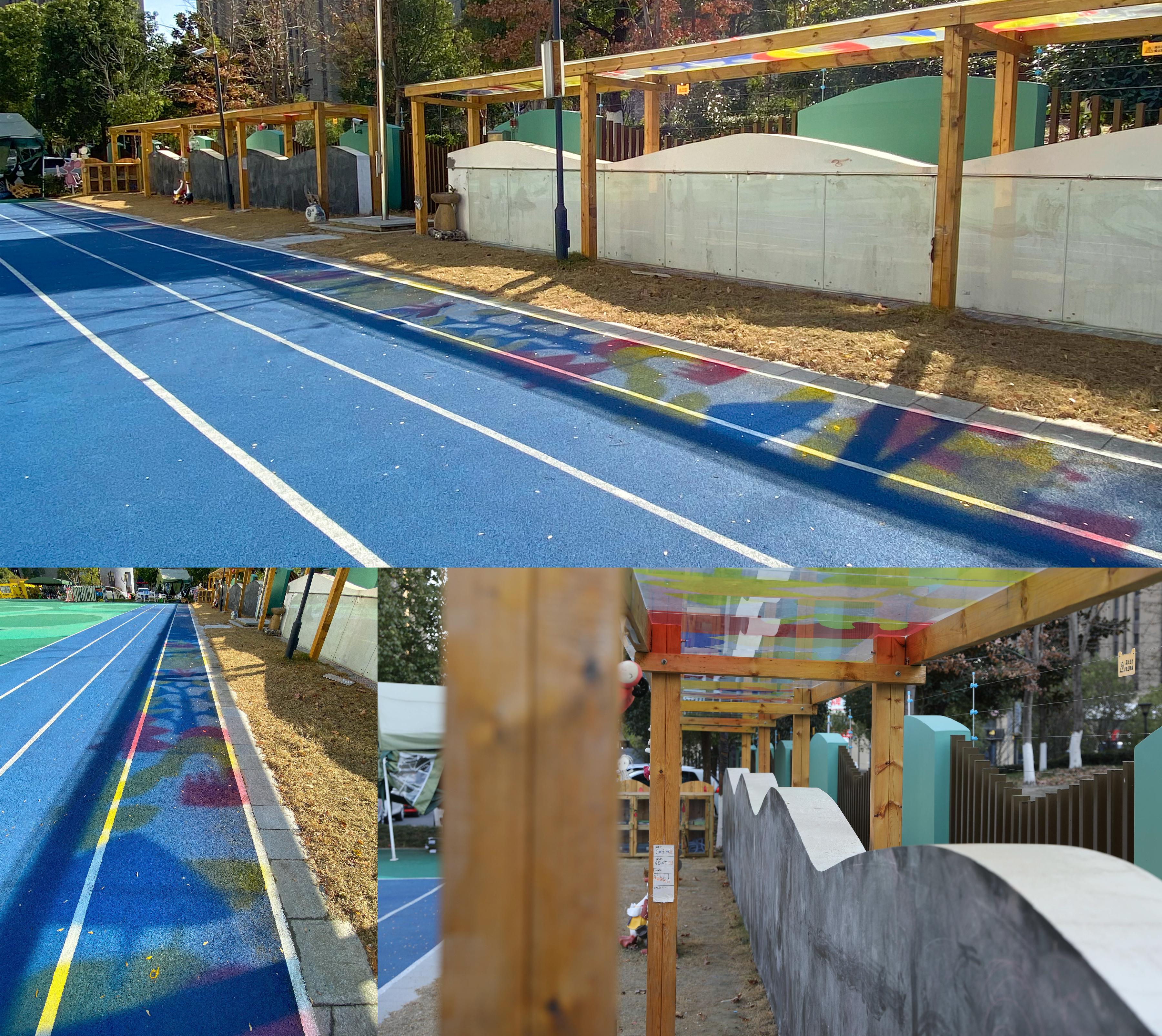
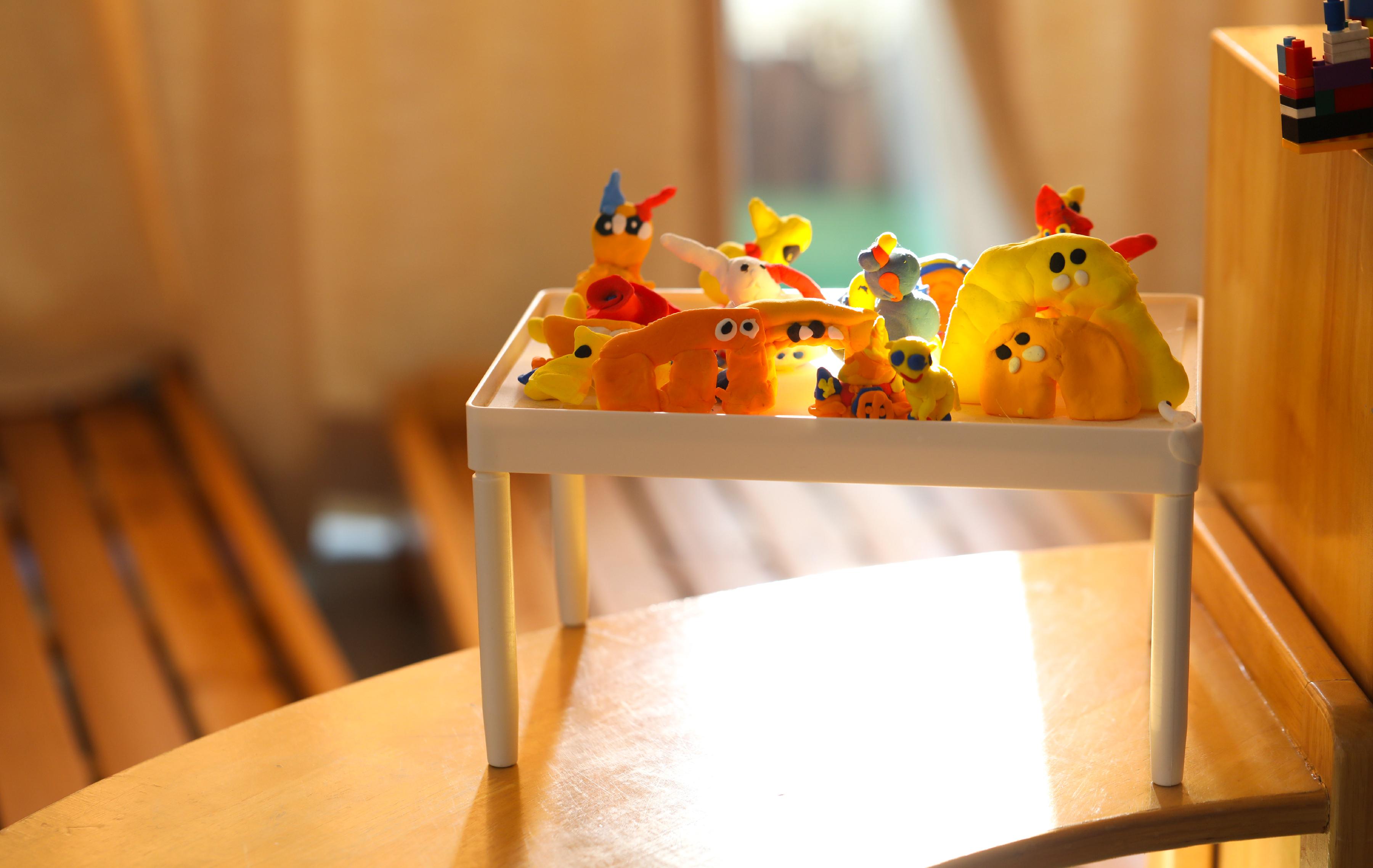
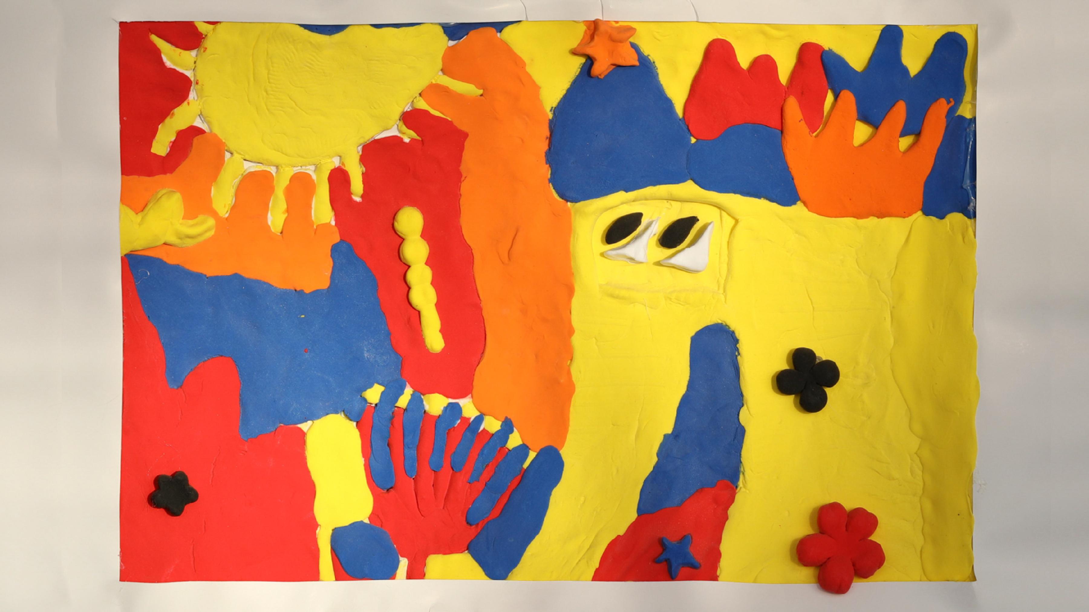
背景: 杭州下沙启源幼儿园教育集团之下有3个幼儿园,分别为启源、启慧、凌云幼儿园,而当时正是疫情封禁。 创意: 1、由于疫情封控,授课以网课为主。但问题在于——学前教育用网课的价值与意义不大,学前教育的关键 不在传授知识,而是让从未离开过家庭的孩子脱离家庭,熟悉陌生环境与社会化,让孩子们熟悉“父母”以 外的各类事物,这需要社交、聚集、言传身教。 2、要帮助学校、家长、孩子们打破这样的窘境。即使有阻力,也让孩子、老师、家长有更多互动。突破应试教 育中“每个人做好自己的就行”局限性,用PBL(Project base learning)项目制模式,让孩子们、家长、老 师一起参与在项目里。学前教育的最大职能是让孩子熟悉“社会”,而社会最大的特征是——分工,那就让 大家在项目中寻找自己的角色。 3、项目是整个幼儿园教育集团,还包含了3个幼儿园,品牌设计必须包含自上而下的逻辑关系——我们将 集团LOGO设计成眼睛的形状, 再让“眼睛”深入3个幼儿园视觉中,让其无处不在,从而建立上下级联系。 结果: “孩子们自己设计幼儿园”的概念受到教育界一致好评,并在中国最大的设计教育展中获得 最佳品牌设计奖,同时获得台湾金点奖、德国国家设计奖、德国红点奖、360design年度社会奖、 日本GOOD DESIGN,以及入围中国可持续性设计大奖,在网上具有百万的曝光量。

BACKGROUND: Under the Hangzhou Xiasha Qiyuan Kindergarten Education Group, there are three kindergar- tens: Qiyuan, Qihui, and Lingyun Kindergarten. This was during the COVID-19. IDEA: 1、Due to the pandemic lockdown, online classes were the main mode of instruction. Howev- er, the challenge was that the value and significance of online classes in preschool educatio- n were limited. The essence of preschool education lies not in imparting knowledge but in helping children, who have never left their homes, break away from the family environment, become familiar with unfamiliar surroundings and socialization, and acquaint themselves with various real-world objects beyond their "parents." This requires social interaction, gathering, and learning through example. 2、We aimed to help schools, parents, and children overcome this predicament, fostering more interaction even in the face of resistance. We aimed to break the mold of "everyone for themselves" under exam-oriented education, employing Project-Based Learning (PBL) to involve children, parents, and teachers in the project together. The primary function of pres- chool education is to introduce children to "society," and the defining characteristic of society is division of labor. Thus, the project encouraged participants to find their roles with in it. In the end, we planned for the children to become little designers, creating various illu- strations for the kindergarten. Once the pandemic's constraints were lifted, they would see a kindergarten that truly "belongs to them." 3、The project encompassed an entire kindergarten education group, including three kinder- gartens. The brand design needed to convey a logical relationship from top to bottom. We designed the group logo as an eye, symbolizing oversight, and embedded the "eye" into the visual identity of the three kindergartens, creating a pervasive presence to establish hierar- chical connections. The project included "Kindergarten Brand Redesign and Design," "Kinde- rgarten Wayfinding System Design," and "Kindergarten Environment Renovation."

