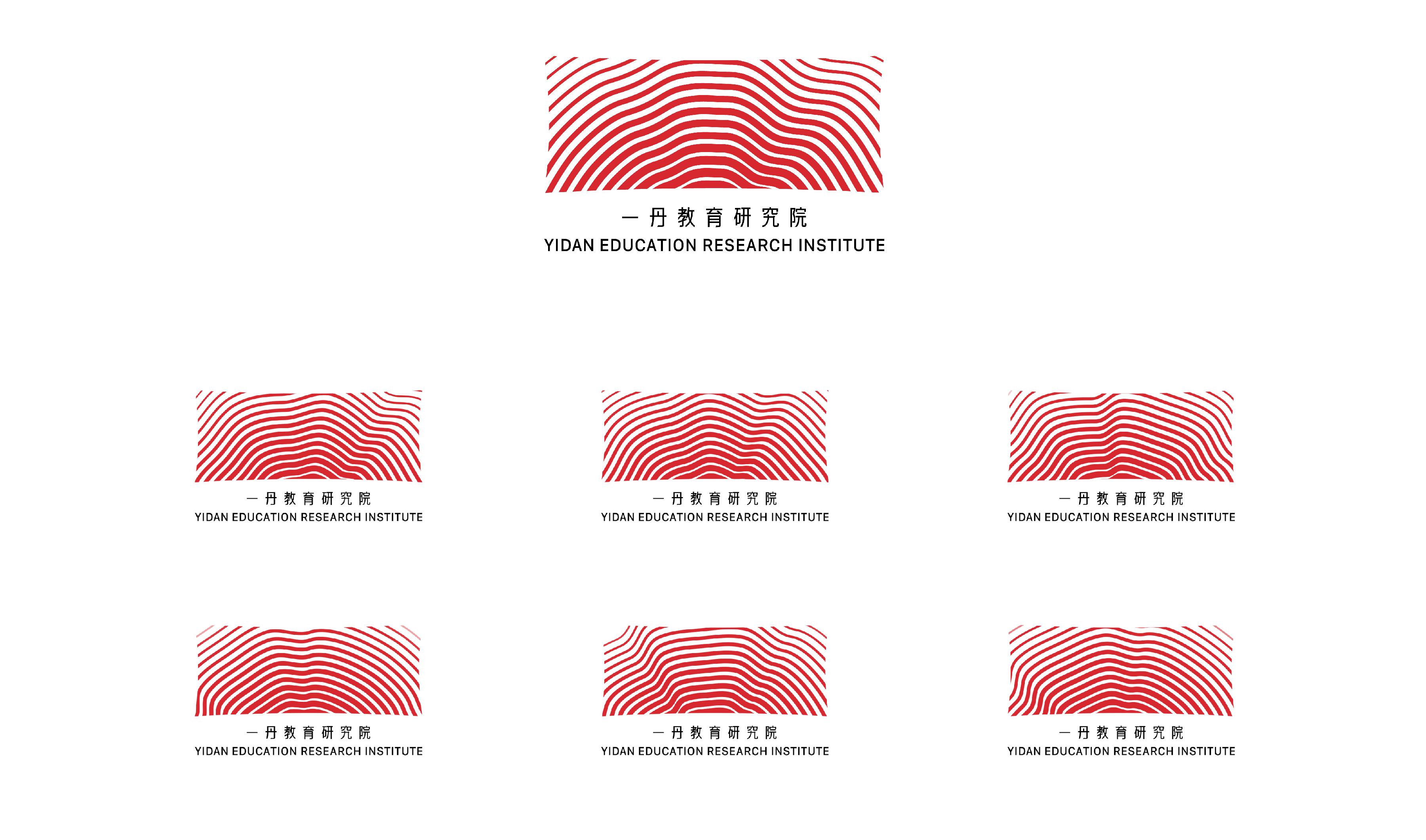
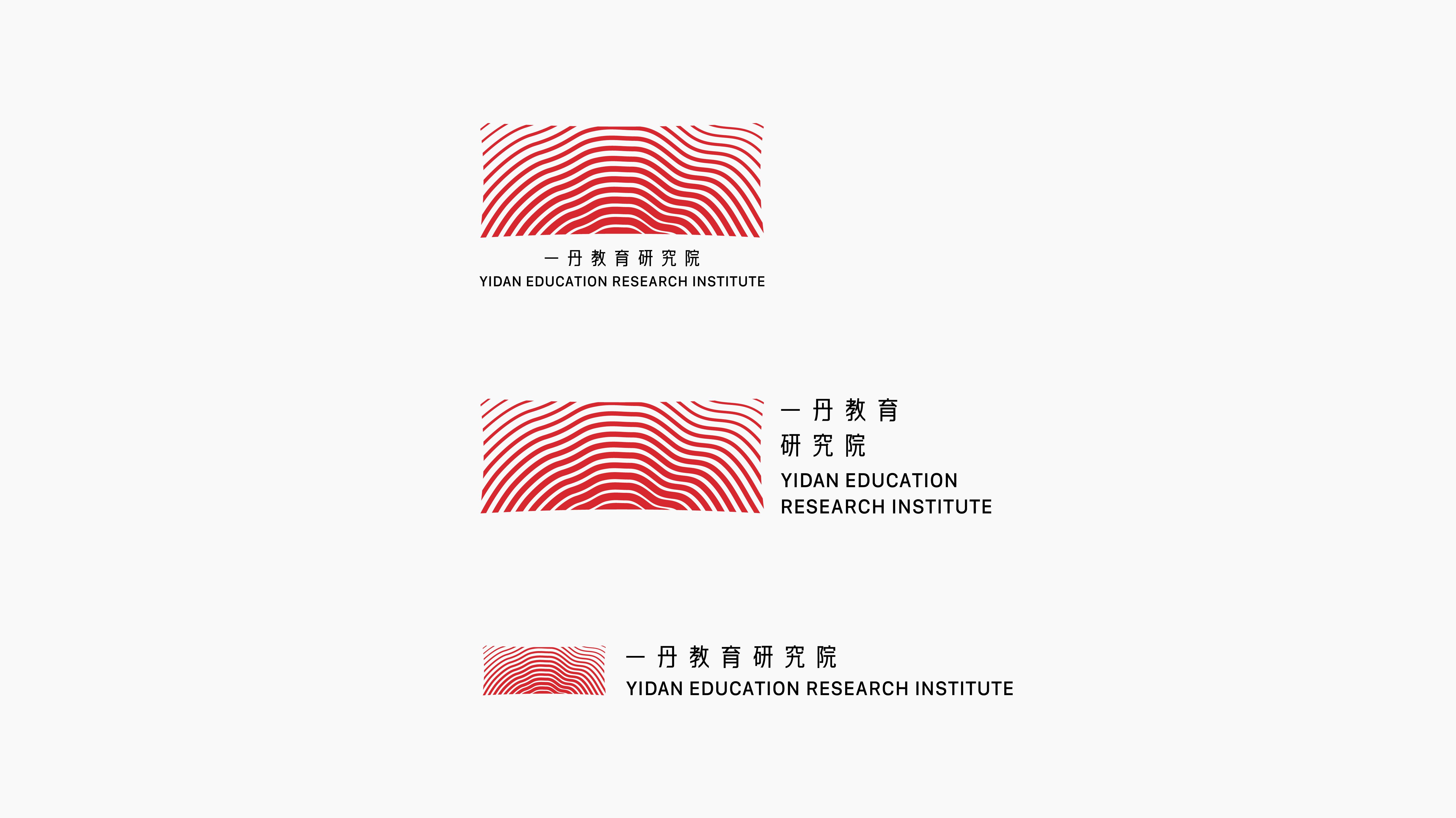
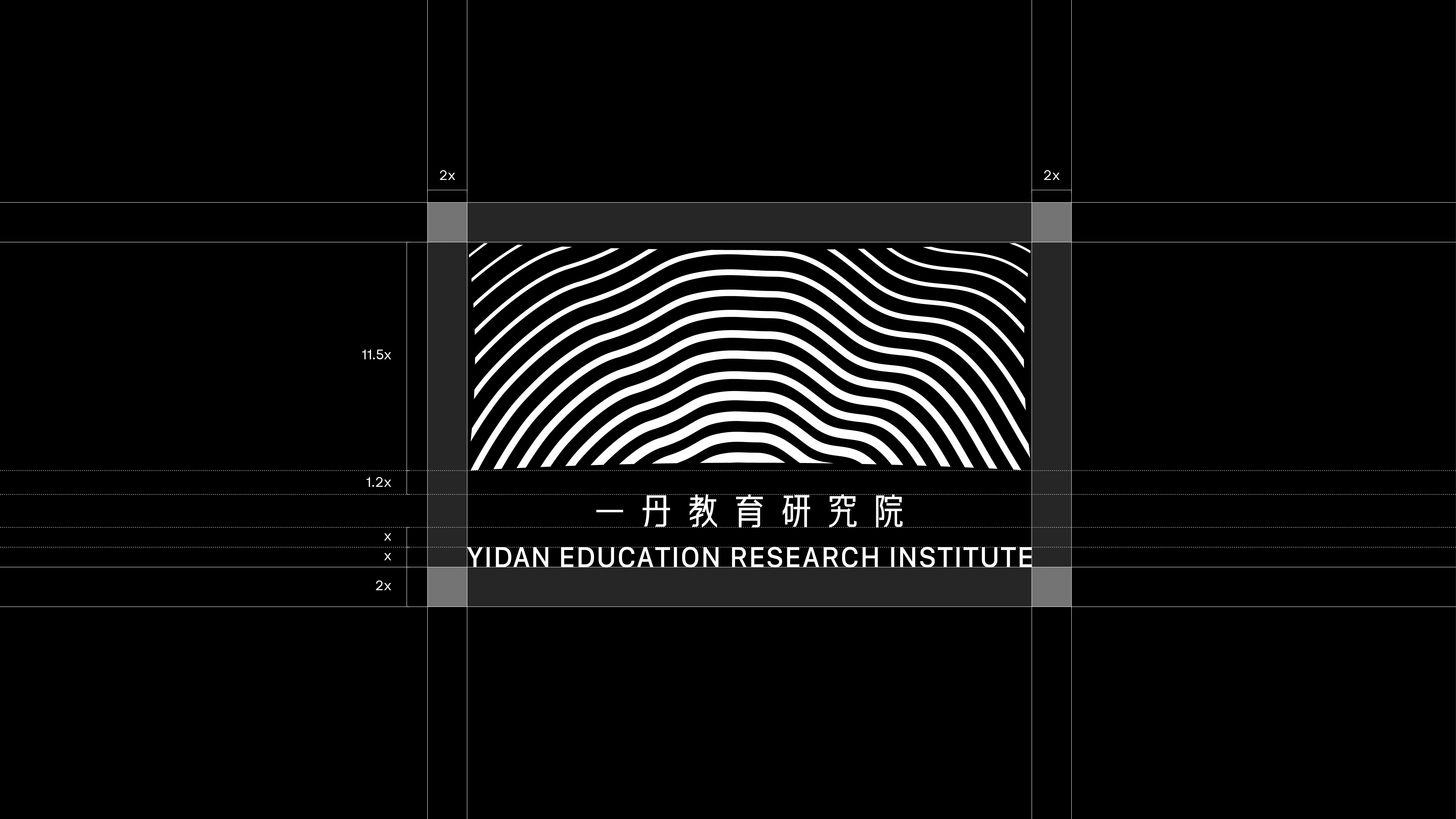
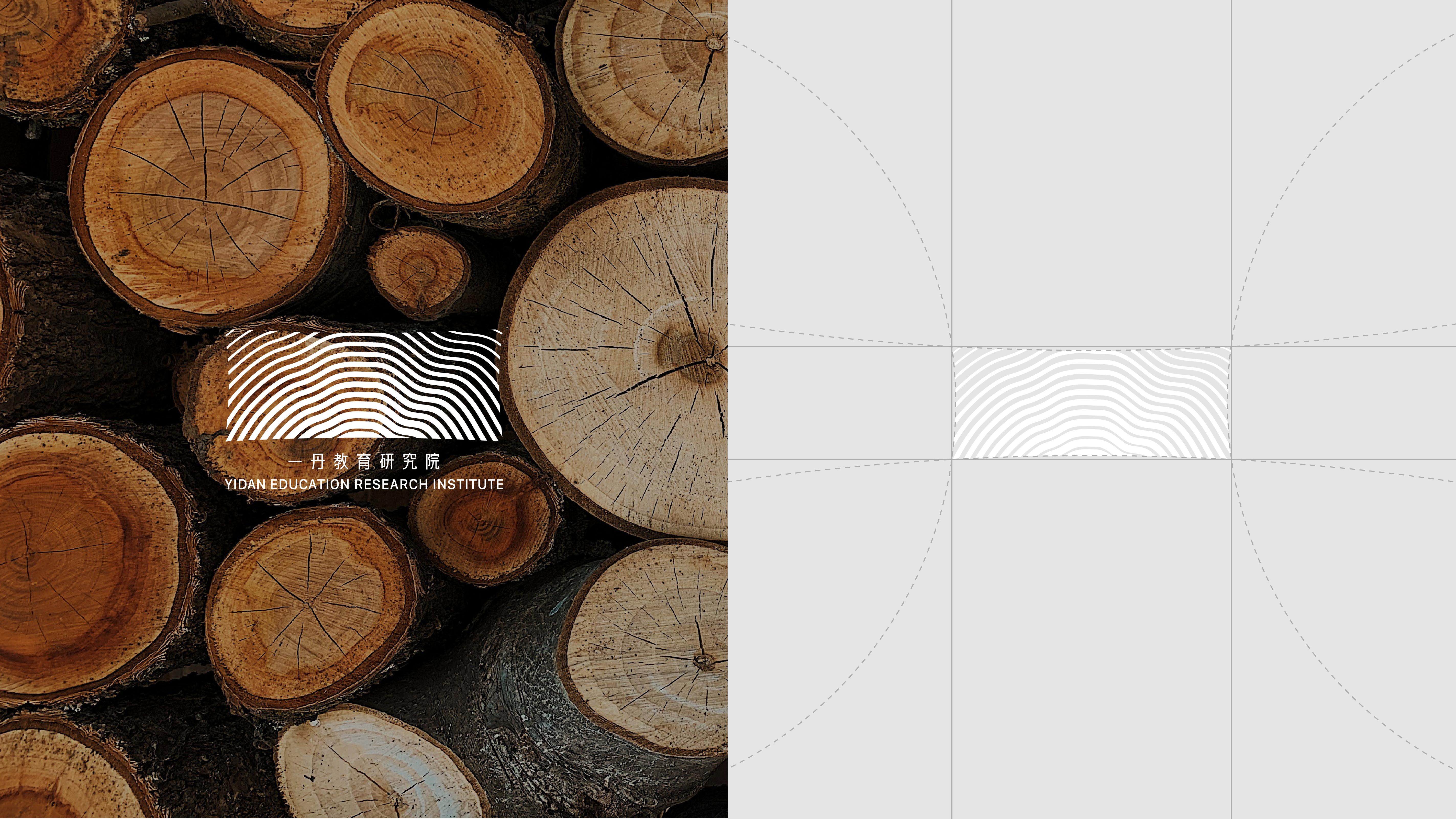
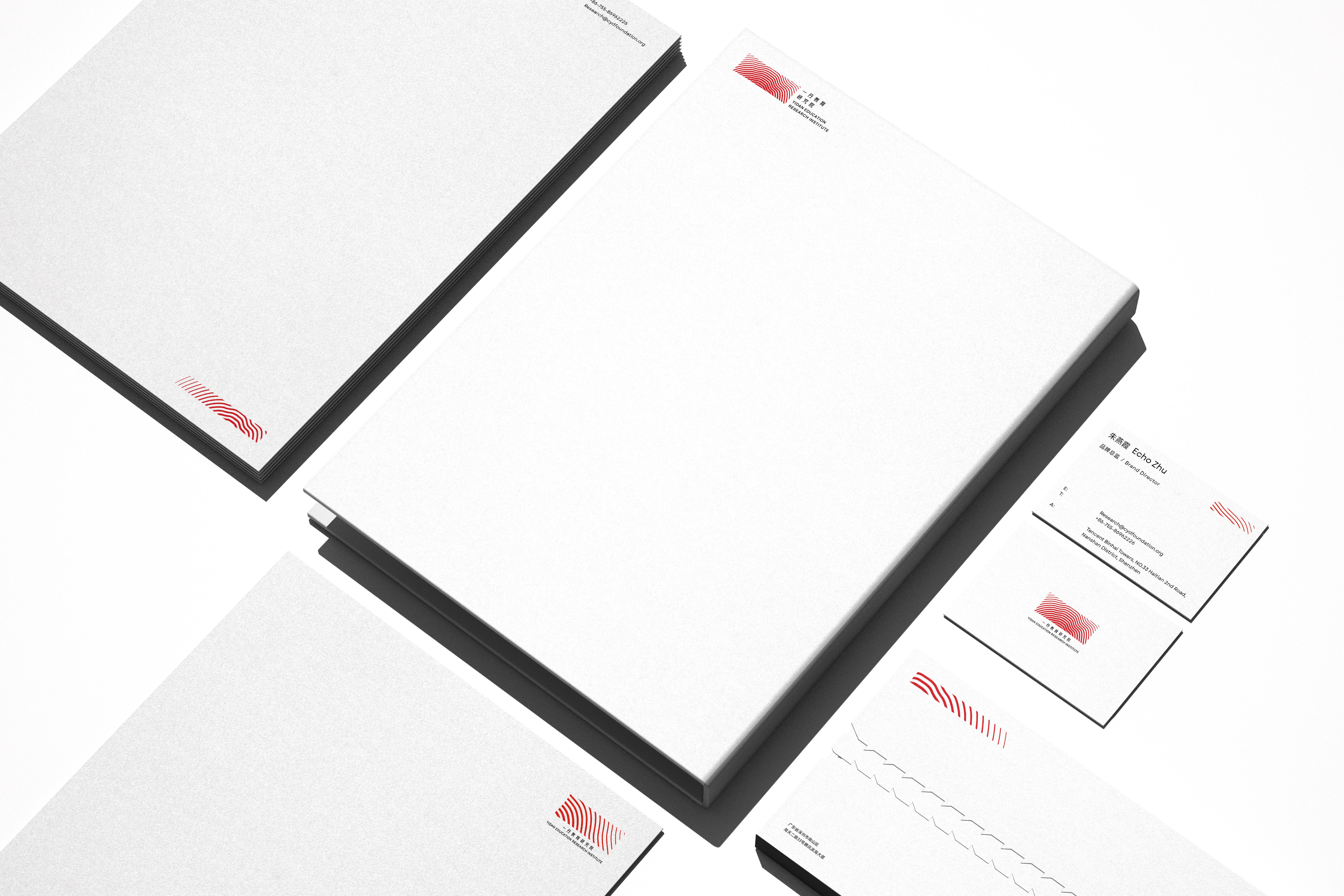
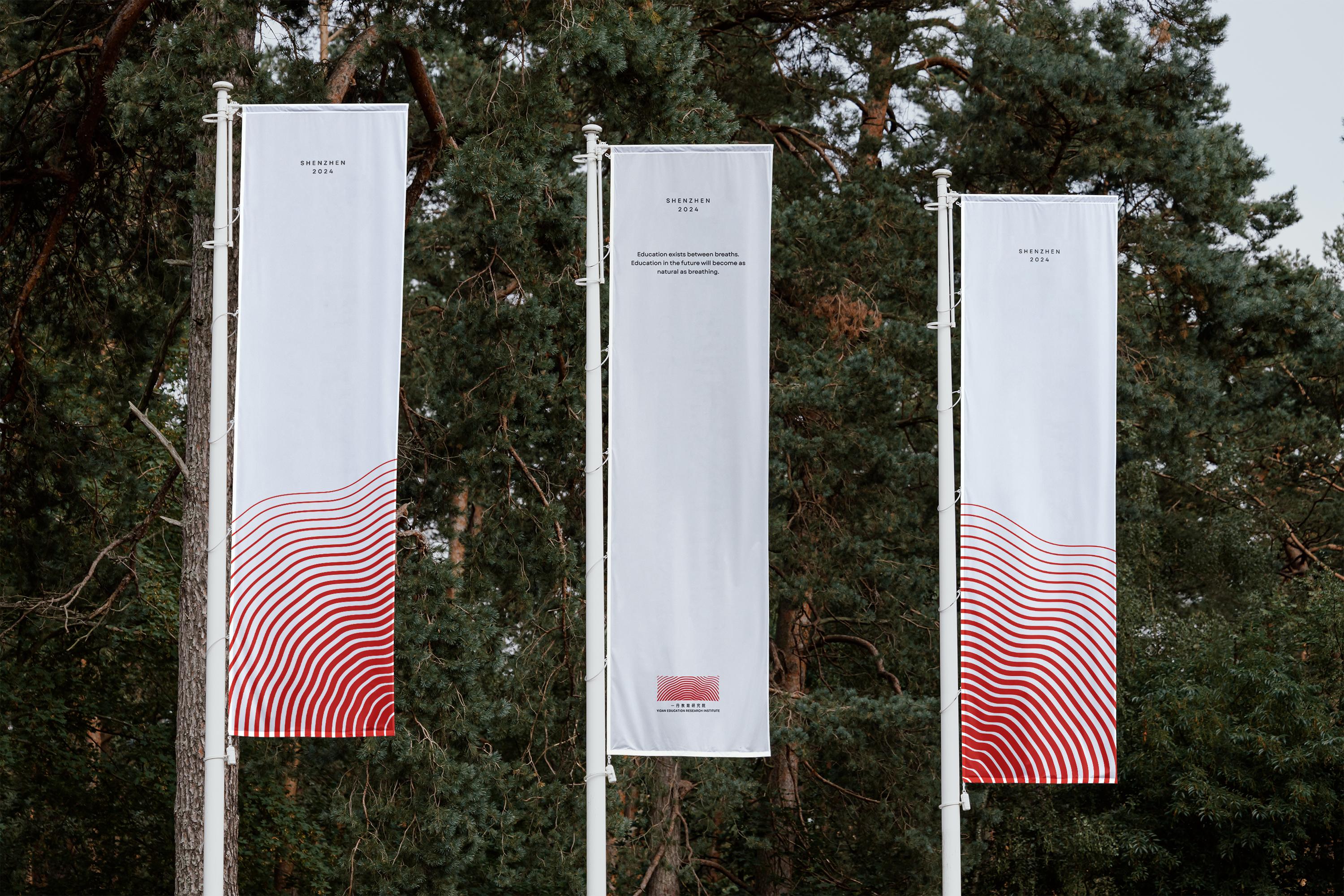
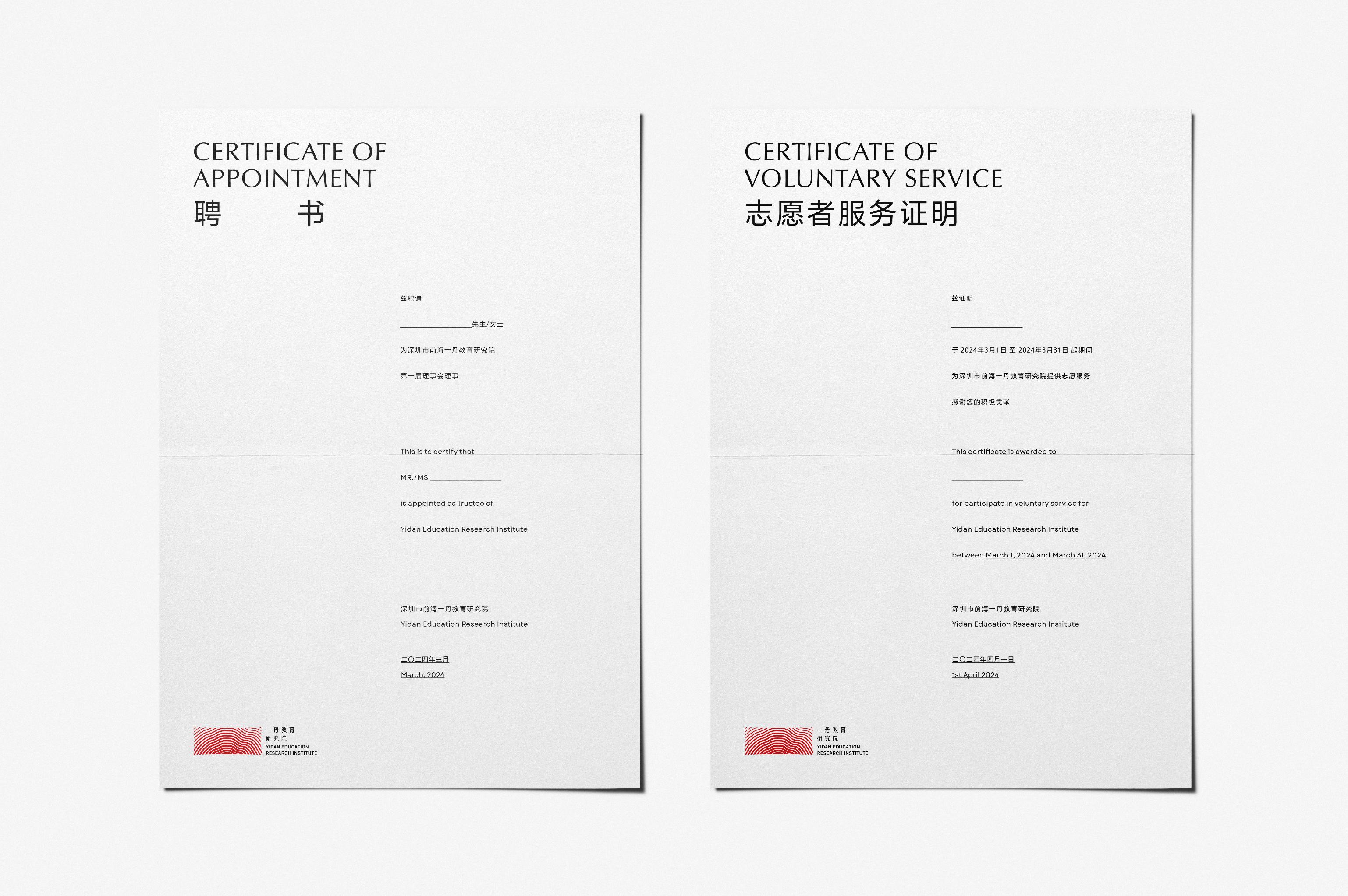
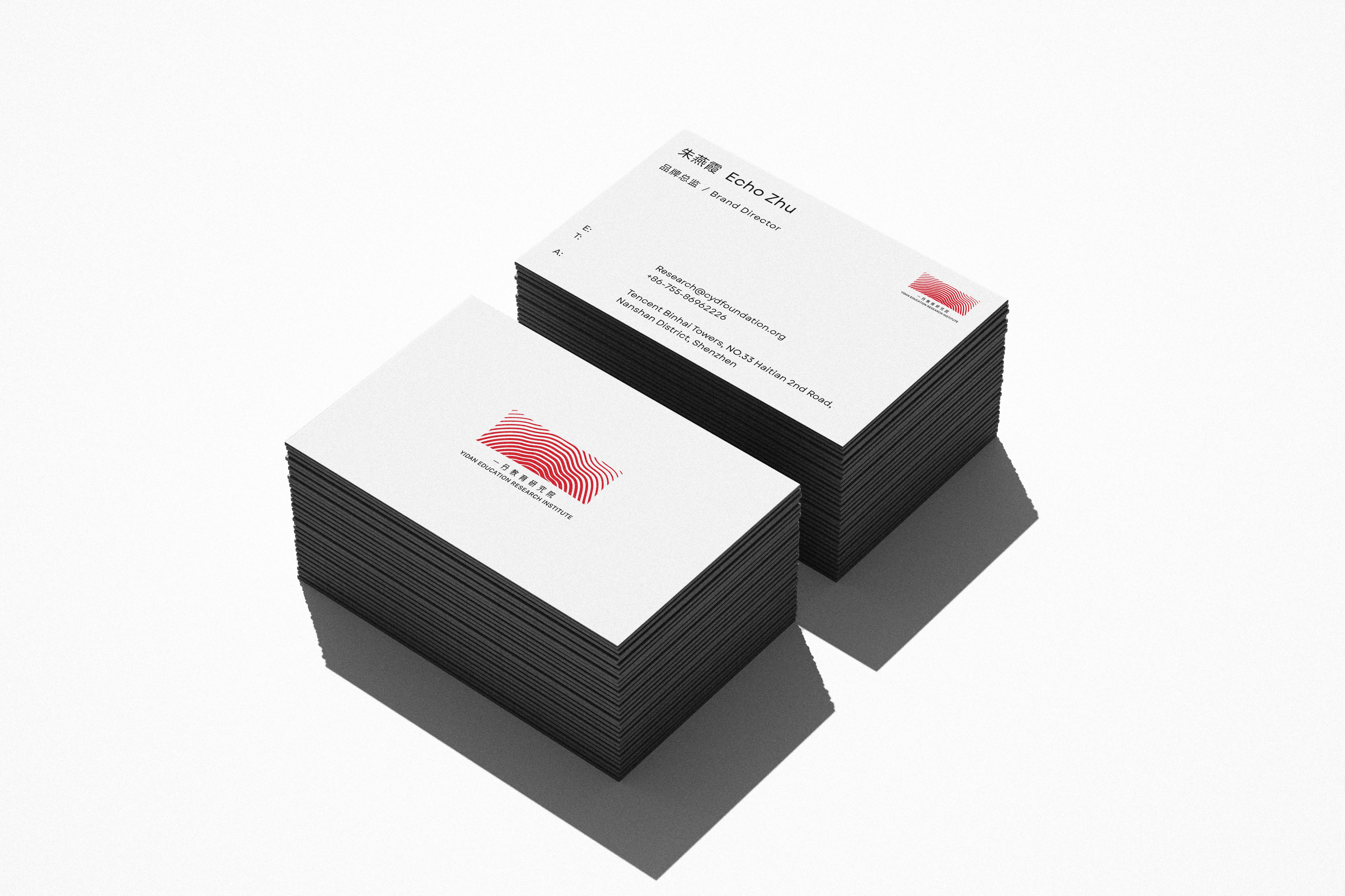
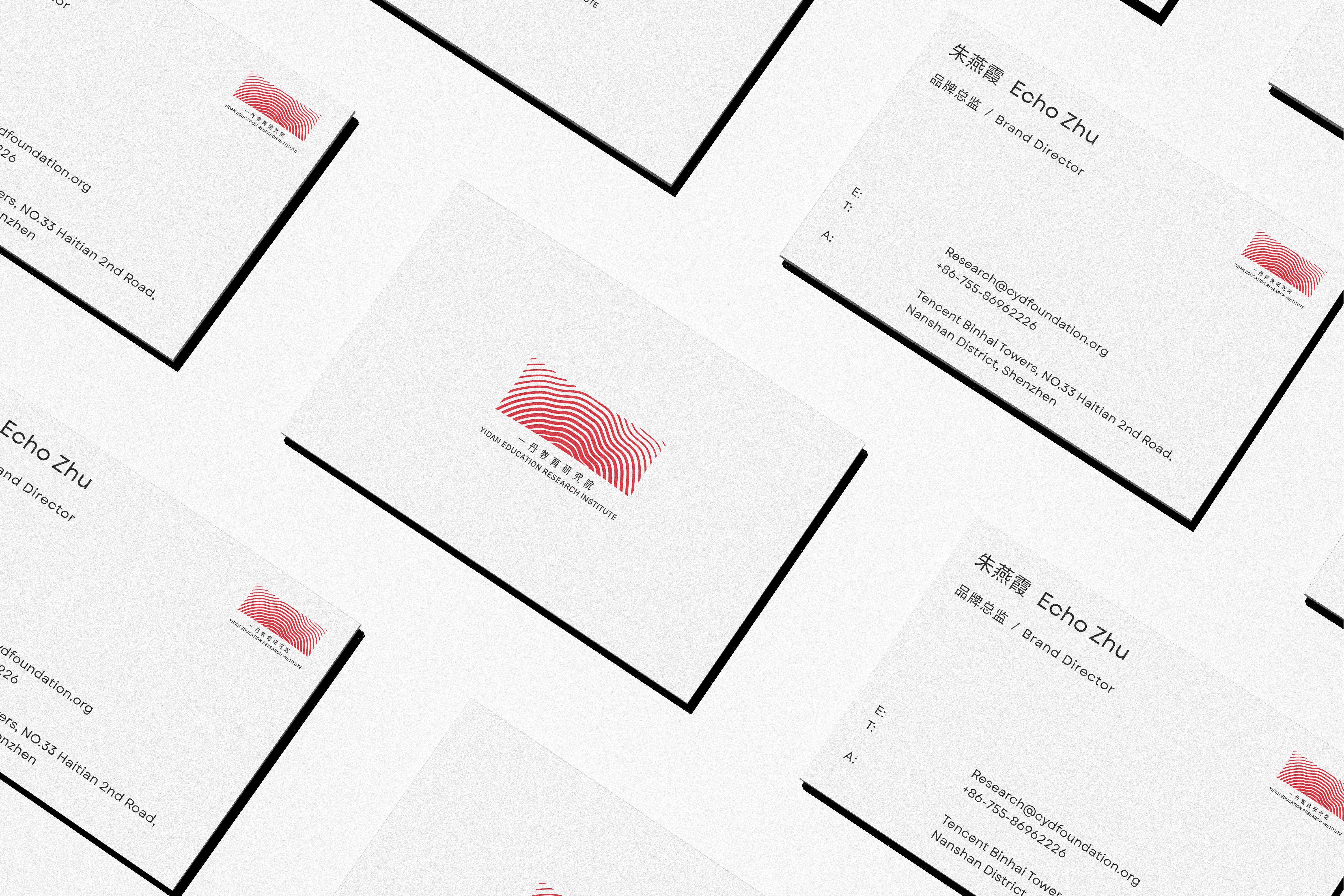
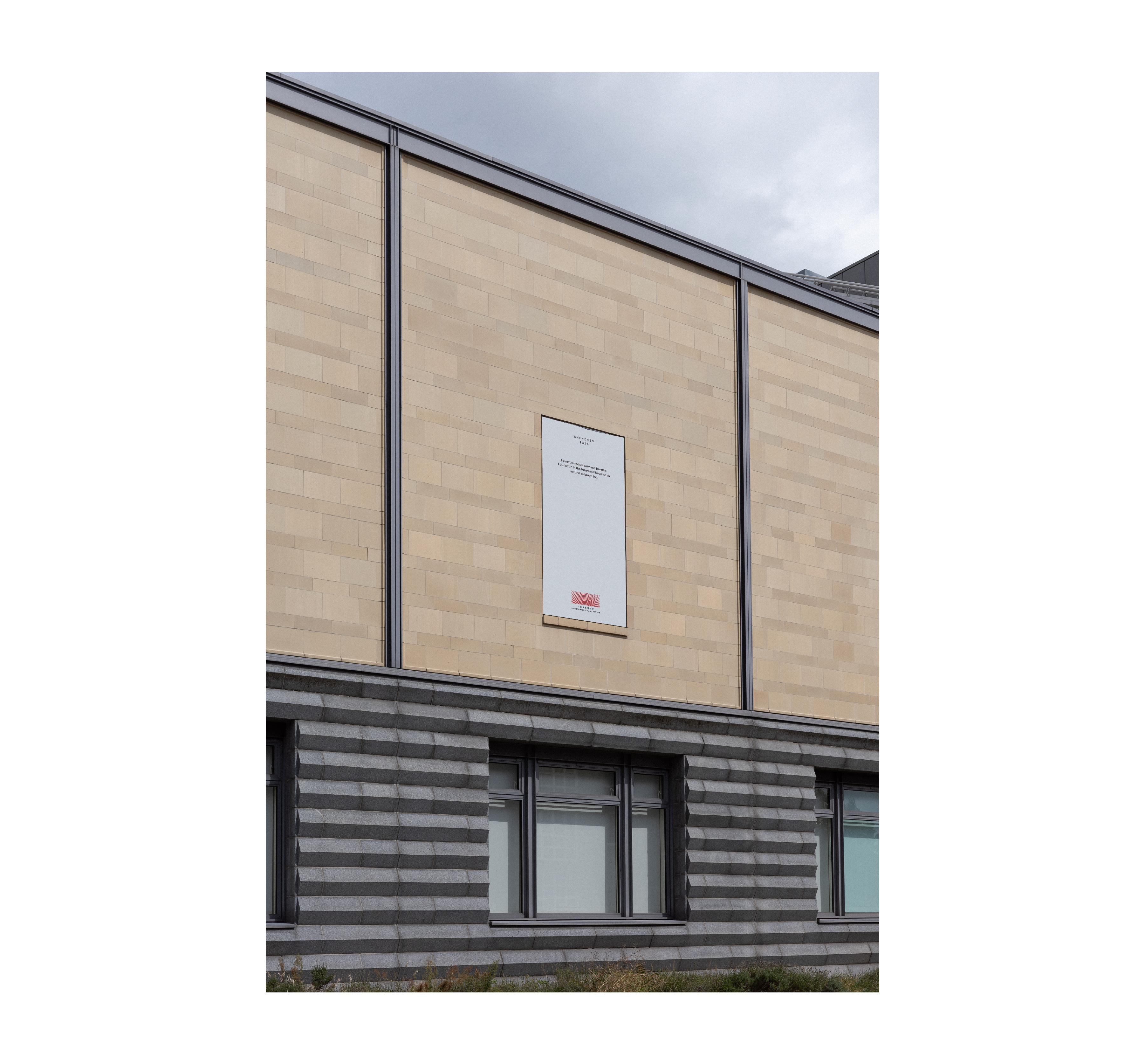
背景: 一丹教育研究组从一丹基金会中成立一丹教育研究院,需进行VI设计。 客户要求: 1、与陈一丹基金会的视觉要有关联。 2、具有一丹研究院工作内容与特性,展现出研究院独特的精神内核。 创意: 1、陈一丹基金会的视觉ICON是指纹、颜色是红色,我们在研究院相关的出版物中也搜寻到关于陈一丹先生对研究院的诗意化描述: 通过这些文字的风景,我看到了一群种树的人、一群在春天播撒种子的人。 这些行动的理想主义者,在种植和培育重要的想法,让教育变得比以前更好。 所以我们利用形似指纹的元素“年轮”作为创意出发点,以“教育自然生长的印记”作为概念切入点, 将“年轮”作为研究院的视觉ICON,并也以红色作为主色调,来满足基金会有关联性,这一需求。 2、通过挖掘创始人陈先生在《《让学习更快乐》《未来学习者的素养和教育》《武汉学院2024演讲》中,挖掘出关键词“求变”,所以我们将logo设置成了自然生长的动态标识,来演绎研究院独特的精神内核。
BACKGOUND: The Yidan Education Research Group has established the Yidan Education Research Institute from the Yidan Foundation and requires VI design. Client requirements: 1、It should have a visual connection with the Yidan Foundation. 2、It should reflect the work content and characteristics of the Yidan Research Institute, showcasing the unique core spirit of the institute. IDEA: 1、The visual icon of the Yidan Foundation is a fingerprint, with red as its main color. We also found poetic descriptions by Mr. Chen Yidan about the Institute in relevant publications: "Through these words, I see a group of people planting trees, a group of people sowing seeds in the spring. These idealists, in their actions, are planting and nurturing important ideas that make education better than before." Therefore, we used the "growth rings," which resemble fingerprints, as the creative starting point. The concept of "the marks of education's natural growth" serves as the entry point, with the "growth rings" becoming the visual icon for the Research Institute. We also adopted red as the primary color to fulfill the requirement of visual connection with the Foundation. 2、By exploring key phrases from Mr. Chen's speeches in "Making Learning Happier," "The Literacy and Education of Future Learners," and "Wuhan University 2024 Lecture," we identified the keyword "seeking change." As a result, we designed the logo as a dynamic symbol of natural growth, reflecting the unique core spirit of the Institute.
